Validation feedback
Validation feedback provides important information to users during and after form submission. These notifications include:
- In-line feedback at or near the form controls
- Overall summaries that are typically provided after form submission
While error messages are the most usual and critical use for validation feedback, success messages are also important to confirm task completion.
| Form control validation notification | Validation summary | |
|---|---|---|
| Priority | High | High |
| Expectancy | Unexpected | Unexpected |
| Blocking | Non-blocking | Non-blocking |
| Required | ||
| Information | Meaningful instruction | Guided summary, reiterating validation notifications |
| Location | In the associated section of the affected required form field | Client validation: below the form Server validation: at the top of the page |
This notification is primarily an error detection response to incorrect or incomplete data entered into a form control, such as an input, checkbox, radio or select. Its goal is to communicate immediate feedback to the user.
Its purpose is to:
- Act as instruction, once the form field or form group has been filled out by the user
- Act as confirmation that a field requiring specific formatting is valid
- Notify users of a potential problem that may require their attention
- Notify users of successful task completion
When to use
- A user is typing into a form control which has complex formatting requirements
- Providing errors or warning UI related to user-entered formatting or invalid selections
- Providing errors or warning messaging related to user-entered formatting or invalid selections
- Providing success confirmations related to a user-entered form control which complies with formatting requirements
- Providing errors or warning messaging related to user-entered formatting, incomplete inputs, or invalid selections
- Elevating error or warning UI that was already provided via on change or on input validation #dont
- Confirming that a task or process initiated by the user was completed successfully (see transient status notifications)
- Providing contextual information on the page processes (see transient status notifications)
- Providing summaries of errors, warnings, or success messaging related to form submission (see validation summaries)
- Page usage should be blocked until the user takes an action within the message or exits (see user confirmation alerts) ::
- Ensure the message container can receive focus
- Include the
aria-liveorrole=”status”markup to announce the notification without interrupting the page flow of the user - Use meaningful colors and iconography
- Ensure the container is visually and programmatically adjacent to the element
- Display the container within the context of the action
- Ensure the instruction is visible to all users by avoiding moving the form fields up and down when displaying validation. Display instruction at the right place:
- For a singular form element, directly below the field in error, replacing the bottom helper text if present
- For a group of elements such a form group of checkboxes, below the fieldset container
- Provide suggestions (when known) to correct the errors
- Content should be available as programmatically-discernible text
- Ensure content is meaningful. Use clear, specific, and simple language
- Be as concise as possible
- Provide the state of the error, if using visual cues for error, warning, success, or info—that text should be provided via screen reader accessible text
- Clearly state errors by saying what happened, and what the next step the user should take to succeed
- Use language to convey REI's brand
- Confirm successful submission of data
- Use meaningful colors and iconography
- Relying solely on references to sensory characteristics (for example, "round button" or "button to the right")
- Relying solely on visual cues to indicate an error
- Removing incorrect data entered by the user
- Providing validation messages for unfilled inputs until the users attempts to submit the form
- Using technical language
- Shaming the user for the error
- Joking with the user about the error
- Using cute language
- Using uppercase text as it gives the visual impact of shouting
- Select one of the set of options
- Select at least one but only to 'x' amount of options
- Adding
aria-describedbyto thelegend, linking to a span out of the form-group. This produces mixed results across the assisted tech matrix - Using
aria-describedbyto thefieldset, linking to a span out of the form-group. This produces mixed results across the assisted tech matrix - Adding the
aria-invalidattribute to form-group controls as this may cause user confusion on if all or just one item is required - Provide extra error indication, summarizing pre-existing form control notifications
- Act as a summary for multiple validation problems
- Provide validation instruction returned by the server
- Summarizing and directing users back to existing errors
- Increasing visibility of existing errors
- Providing server-returned instruction #dont
- Confirming that a task or process initiated by the user was completed successfully (see transient status notifications)
- Providing contextual information on the page processes (see transient status notifications)
- Providing errors, warnings, or success messaging related to user entered formatting, incomplete inputs, or invalid selections (see validation notifications)
- Page usage should be blocked until the user takes an action within the message or exits (see user confirmation alerts)
- As the only indication of an error ::
- Ensure the message container can receive focus
- Move user focus to this summary when presented
- Focus can be set to the message with client-side scripting
- Include an anchor name in the URL for server-returned summaries
- Ensure the instruction is visible to all users
- Use meaningful colors and iconography
- Use
role="alert"to assertively reiterate existing page errors if the summary is presented prior to page reload - Present the container adjacent to the form when the summary is presented prior to page reload
- Present the container at the top of the page when the summary is provided post form-submit
- Provide suggestions (when known) to correct the errors
- Content should be available as programmatically-discernible text
- Ensure content is meaningful. Use clear, specific, and simple language
- Be as concise as possible
- Provide the state of the error, if using visual cues for error, warning, success, or info—that text should be provided via screen reader accessible text
- Clearly state errors by saying what happened, and what the next step the user should take to succeed
- Use language to convey REI's brand
- Confirm successful submission of data
- Use meaningful colors and iconography
- Relying solely on references to sensory characteristics (for example, "round button" or "button to the right")
- Relying solely on visual cues to indicate an error
- Removing incorrect data entered by the user
- Providing validation messages for unfilled inputs until the users attempts to submit the form
- Using technical language
- Shaming the user for the error
- Joking with the user about the error
- Using cute language
- Using uppercase text as it gives the visual impact of shouting
- Require the user to select one of the set of options
- Require the user select at least one but only to 'x' amount of options
- Adding
aria-describedbyto thelegend, linking to a span out of the form-group. This produces mixed results across the assisted tech matrix - Using
aria-describedbyto thefieldset, linking to a span out of the form-group. This produces mixed results across the assisted tech matrix - Adding the
aria-invalidattribute to form-group controls as this may cause user confusion on if all or just one item is required
On input
On change
On submit
Validation notification anatomy
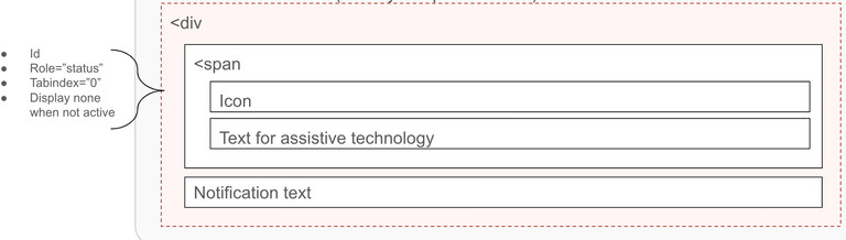
Container
Best practices
Options
Validation notification containers may be hidden until the user requests them if the notification instructions are not critical.
Instruction content
Best practices
What to avoid
Options
Validation notification content may provide instruction that changes progressively to guide the user through the error process.
Grouping controls
Form groups are a collection of elements, defined by a shared label using the legend tag. Grouping controls should dynamically inject the error instruction as a span into the form-group legend.
Best practices
We do not recommend requiring elements within a form group, since there should be no incorrect answer for these elements. They are either true or false. When designing a form where a user must make a selection, consider using a select control. However, it is common to see these groups require the user to:
What to avoid
A validation summary outlines, informs, and directs users to all existing errors that need to be fixed on the page. It is meant to help users who may have lost sight of the problems needing correction and have become stuck on submit. As this may be the only error notification within a user's viewport, we recommend providing links to each specific error.
Its purpose is to:
When to use
Validation summary anatomy

Container
Best practices
Options
Validation summary containers may be hidden until the user requests them if the notification instructions are not critical.
Instruction content
Best practices
What to avoid
Options
Validation notification content may provide instruction that changes progressively to guide the user through the error process.
Grouping controls
Form groups are a collection of elements, defined by a shared label using the legend tag. Grouping controls should dynamically inject the error instruction as a span into the form-group legend.
Best practices
We do not recommend requiring elements within a form group, since there should be no incorrect answer for these elements. They are either true or false. When designing a form where a user must make a selection, consider using a select control. However, it is common to see these groups have the following needs:
What to avoid
<cdr-input
  v-model="defaultModel"
  :background="backgroundColor"
  label="Input label"
  :error="modelError"
  @blur="validateInput"
>
  <template #helper-text-bottom>Must be 4 or less characters</template>
</cdr-input>
Use aria-live to indicate that an element will be updated. It describes the types of updates the user agents, assistive technologies, and user can expect from the live region.
Use aria-atomic to indicate whether assistive technologies will present all, or only parts of the changed region based on the change notifications defined by the aria-relevant attribute.
For further reading on accessibility, check out these references: