icon
CdrIcon - Communicates meaning through graphics representing simple and complex ideas Icons are visual symbols that represent actions, objects, or concepts. Use icons to enhance usability and provide visual cues. Always ensure icons have appropriate accessible labels when used without accompanying text.
When to use
- Communicating simple actions and concepts that are easily understood, such as printing a receipt or sending an email
- Making navigation easier for common actions, such as return to home page or search
- Representing an action, object or concept at a high level of abstraction, such as using the snowflake icon to represent snow sports
- Notifying users about status, such as the number of items in a shopping cart or a warning message
- Conserving space for concepts that are difficult to depict, such as the progress icon or the 3-line “hamburger” menu
When not to use
- An icon’s meaning isn’t immediately clear or recognizable ::
Sizes
Icons are available in three sizes: small (16px), medium (24px), and large (32px). Default size is medium (24px), but designers can choose a different size.
Adding adequate space around the icon allows for legibility and touch. A minimum touch target area of 40px is recommended for standalone iconography.
When the mouse and keyboard are the primary input methods, or when icons are paired inline with text, measurements may be condensed to accommodate denser layouts. Icon size should align to the line-height of the paired text element.
Do provide at least 40 pixel target area.
Don't make click or touch target too small.
Color
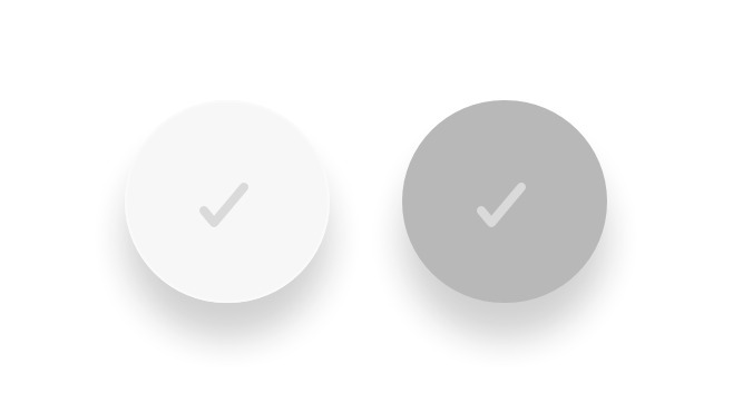
Ensure icons use the ratio of 4.5:1 contrast between icon color and background color. Follow recommendations for pairing color tokens in our color guidelines article.
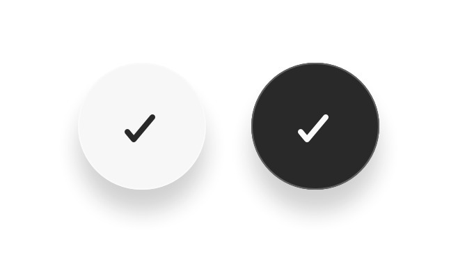
Do use primary color tokens for icon color.
Dont create new color tokens for icons or use secondary color tokens.
Choosing the right icon
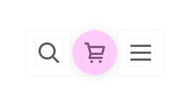
When using icons with links or buttons ensure the icon communicates your intended meaning.
Do use the appropriate icon.
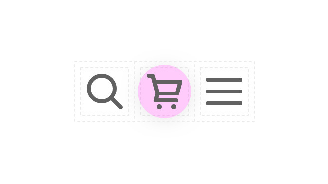
Don't change the meaning or intention of the Cedar icons.
Recommendations for writing screen reader text:
- Be succinct. Exclude unnecessary words
- Be informative and accurate
- Write in the active voice
- Avoid technical jargon
What Cedar provides
CdrIcon by default adds aria-hidden="true" to the root SVG element. If you are using CdrIcon for purely decorative reasons, or if the icon is already explained by the text surrounding it, then there are no other accessibility steps needed.
Development responsibilities
When using this component, here's what you are responsible for:
For a button only containing an icon:
- Add an
aria-labelto the button element describing what the button does
<cdr-button
  :icon-only="“true”"
  aria-label="“Add"
  to
  Cart”
>
  <icon-cart />
</cdr-button>
For a link only containing an icon:
- Include screenreader-only text inside of the link element using the
cdr-display-sr-onlymixin from@rei/cdr-tokens
<cdr-link href="/cart">
  <icon-cart />
  <span class="sr-only">Go to cart page</span>
</cdr-link>
For a button or link containing text alongside an icon:
- If the text provides sufficient description on its own (for example, "Add to cart" with a cart icon) there is no need to add any additional accessible text
<cdr-button>
  <icon-cart />
  Add to Cart
</cdr-button>
- If the icon has meaning not conveyed by the text, add
aria-hidden="true"to the icon. Also use thecdr-display-sr-onlymixin from@rei/cdr-tokensto insert screenreader-only text into the button or link in the appropriate place
<cdr-link>
  <icon-check-lg />
  <span class="sr-only">Available For</span>
  Curbside Pickup
</cdr-link>
For an icon existing outside of a link, button, or other actionable element:
- Include screenreader-only text alongside the icon describing its meaning. This is the simplest approach for applying accessible text to an icon and has the best support across browsers and screenreaders
<icon-virtual-outfitting />
<span class="sr-only">Virtual Outfitting</span>
- Alternatively, pass a
<title>and<desc>into the default slot of the icon component, each with unique IDs. Addrole=\"img\"andaria-labelledby=\"titleid descid\"to the icon component, replacingtitleidanddescidwith the IDs corresponding to the<title>and<desc>elements. If using CdrIcon with custom SVG, make sure title is the first child element
<icon-ski
  role="img"
  aria-labelledby="skiTitle skiDesc"
>
  <title id="skiTitle">Skiing</title>
  <desc id="skiDesc">A stick figure skiing downhill</desc>
</icon-ski>
The @rei/cedar component package exports an inline Vue component for every icon in the Cedar library. The inline icon components are the easiest way to make use of the Cedar icon library if you are building an application using Vue.
These components are prefixed with the word Icon and are named using PascalCase. For example: IconCaretDown, IconExperiencesBackpacking.
Non-Cedar SVG
The CdrIcon package is simply an SVG with default attributes set for accessibility and styling:
- Use any SVG markup
- All attributes, event listeners, classes, etc. will be carried over except for
viewBox,roleandxmlns - This method will increase HTML file size and slow down performance if using a lot of iconsUse any valid SVG markup in the CdrIcon slot
The svg element in this example will be stripped, but the class and data attribute will be preserved (and could be moved to cdr-icon also)
<template>
  ...
  <cdr-icon>
    <svg
      class="my-class"
      data-example="this stays"
    >
      <title>My icon</title>
      <path
        d="M12 12c1.9329966 0 3.5-1.5670034 3.5-3.5C15.5 6.56700338 13.9329966 5 12 5S8.5 6.56700338 8.5 8.5c0 1.9329966 1.5670034 3.5 3.5 3.5zm6.7621385 7c-.8850139-2.8946791-3.5777143-5-6.7621387-5-3.1844245 0-5.87712493 2.1053209-6.76213876 5H18.7621385zM4 21c-.55228475 0-1-.4477153-1-1h-.00754862a9.07963802 9.07963802 0 0 1 .01314502-.1064258c.00185549-.0175393.0041644-.0349433.00691478-.0522001.43595408-3.2192393 2.56090871-5.9021068 5.45328094-7.1270196C7.26398091 11.7054407 6.5 10.191939 6.5 8.5 6.5 5.46243388 8.96243388 3 12 3c3.0375661 0 5.5 2.46243388 5.5 5.5 0 1.6919391-.763981 3.2054409-1.9657923 4.2143547 2.8923661 1.2249103 5.0173178 3.9077692 5.4532779 7.1269995.0027529.0172699.0050636.0346873.0069201.0522401A9.07834213 9.07834213 0 0 1 21.0075481 20H21c0 .5522847-.4477153 1-1 1H4z"
      />
    </svg>
  </cdr-icon>
  ...
</template>

<script>
import { CdrIcon } from '@rei/cedar'
...
  components: {
    CdrIcon
  }
...
</script>
You can also omit the wrapping svg element.
<template>
  ...
  <cdr-icon>
    <title>My icon</title>
    <path
      d="M12 12c1.9329966 0 3.5-1.5670034 3.5-3.5C15.5 6.56700338 13.9329966 5 12 5S8.5 6.56700338 8.5 8.5c0 1.9329966 1.5670034 3.5 3.5 3.5zm6.7621385 7c-.8850139-2.8946791-3.5777143-5-6.7621387-5-3.1844245 0-5.87712493 2.1053209-6.76213876 5H18.7621385zM4 21c-.55228475 0-1-.4477153-1-1h-.00754862a9.07963802 9.07963802 0 0 1 .01314502-.1064258c.00185549-.0175393.0041644-.0349433.00691478-.0522001.43595408-3.2192393 2.56090871-5.9021068 5.45328094-7.1270196C7.26398091 11.7054407 6.5 10.191939 6.5 8.5 6.5 5.46243388 8.96243388 3 12 3c3.0375661 0 5.5 2.46243388 5.5 5.5 0 1.6919391-.763981 3.2054409-1.9657923 4.2143547 2.8923661 1.2249103 5.0173178 3.9077692 5.4532779 7.1269995.0027529.0172699.0050636.0346873.0069201.0522401A9.07834213 9.07834213 0 0 1 21.0075481 20H21c0 .5522847-.4477153 1-1 1H4z"
    />
  </cdr-icon>
  ...
</template>

<script>
import { CdrIcon } from '@rei/cedar';

...
  components: {
    CdrIcon
  }
...
</script>
CdrIcon
Props
| Name | Type | Default |
|---|---|---|
use Sets the href attribute for use with SVG symbol sprite | string | |
inheritColor Sets icon fill to inherit from parent | boolean | false |
size Sets the icon size | union |
Slots
| Name |
|---|
default |