accordion
Vertically-stacked list that allows users to expand and collapse additional content
| Type | Purpose |
|---|---|
| Compact | Reduces spacing around title and content body. Also, smaller font sizes resulting in overall denser display of content. |
| Border aligned | For aligning the border to the title text and expand/collapse icon. |
| Content spacing | Optionally removes content spacing (css padding) from the accordion content for applications needing more design flexibility. |
| Unwrapped | Renders the accordion content in an “unwrapped” state by using the unwrap property of CdrAccordionGroup. This property accepts either a boolean toggle or a list of breakpoints. |
When to use
- Providing users more content within the same layout
- Displaying content that is directly related, or supplemental, to the main subject of the page
- Designing with limited vertical space and there is enough content to condense
Accordions are for use on either light or dark backgrounds. Background color is provided for both.
Behavior
- Position interactive elements (i.e. select, button or link components) within the container far enough from the title area to avoid accidental collapsing
- Make sure the entire title area is clickable, including icon and background
- Never nest accordions within themselves
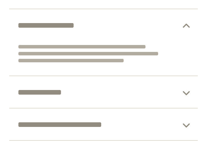
Do present content in a single accordion.
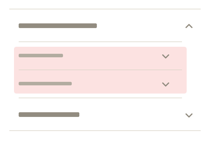
Don’t nest accordions.
Show and hide
Sections do not automatically collapse when another is expanded. Revealing the first accordion section is recommended. Other accordion sections are all hidden by default. However, it's possible to specify that:
- All accordion sections are revealed when page is displayed
- A specific accordion section is revealed with remaining accordion section closed
- Content within accordions can include text, photos, graphics, or other components (i.e. links, buttons, tables)
- Always include a title, icon, and subsequent content for each section (required)
Titles
- Order the accordion titles by priority and importance
- Keep titles short to avoid wrapping at smaller viewports
- Use sentence case for titles
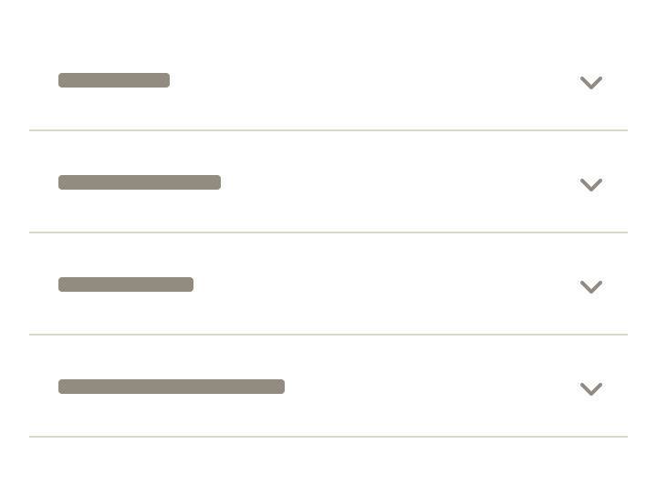
Do keep titles short and concise.
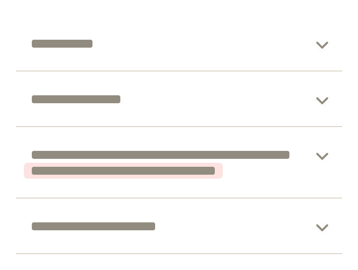
Don't create labels so lengthy that they wrap to a second line.
- Accordion style can change variant based on breakpoint. Example: Default at MD/LG can change to compact and border-aligned at XS/SM
- Accordion style can change variant based on breakpoint. Example: Default at MD/LG can change to compact and border-aligned at XS/SM
- Don’t replace the accordion component with the tab component at different breakpoints
What Cedar provides
- Keyboard interactions to expand and collapse accordion headers
- Keyboard interactions to navigate and reverse navigate through the accordion headers
- Generating ARIA tags for accessibility, specifically
aria-controls,aria-expanded, andaria-hidden
Development responsibilities
When using this component, here's what you are responsible for:
- Provide descriptive label for accordion header
- Be aware that embedding lengthy content in an accordion can be disorienting. When the accordion header expands, it can give the appearance of moving to another page
Using an event listener
CdrAccordion emits an event when its button is clicked. Use an event listener to toggle the value of the opened prop to open or close the accordion.
<template>
  <cdr-accordion
    id="item"
    level="3"
    :compact="true"
    :opened="opened"
    @accordion-toggle="opened = !opened"
  >
    <template #label>Click me to show content!</template>
    This content is revealed when the accordion is opened.
  </cdr-accordion>
</template>

<script>
export default {
  ...
  data() {
    return {
      opened: false
    }
  }
}
</script>
Accordion groups
When creating a group of accordions, use CdrAccordion's complementary wrapping component CdrAccordionGroup. CdrAccordionGroup has no API and acts to enhance accessibility and keyboard interactions for the group.
You may find creating groups useful if you want to close the other accordions when one is opened.
<cdr-accordion-group>
  <cdr-accordion
    v-for="(item, index) in grouped"
    :id="item.id"
    level="2"
    :border-aligned="true"
    :opened="item.opened"
    :key="item.id"
    @accordion-toggle="updateGroup(index)"
  >
    <template #label>
      {{ item.label }}
    </template>
    {{ item.content }}
  </cdr-accordion>
</cdr-accordion-group>

<script>
export default {
  ...
  data() {
    return {
      grouped: [
        {
          label: 'These are border-aligned',
          content: 'These accordions will only allow one open at a time.',
          opened: false,
          id: 'linked1',
        },
        {
          label: 'And they are also linked',
          content: 'Lorem ipsum dolor sit amet, consectetur adipiscing elit. ',
          opened: false,
          id: 'linked2',
        },
        {
          label: 'To close others when one is opened',
          content: 'These accordions will only allow one open at a time.',
          opened: false,
          id: 'linked3',
        },
      ],
    }
  },
  methods: {
    updateGroup(index) {
      const { opened } = this.grouped[index];
      if (opened) {
        // closing opened accordion
        this.grouped[index].opened = false;
      } else {
        // open closed accordion. close all others.
        for (let i = 0; i < this.grouped.length; i += 1) {
          this.grouped[i].opened = index === i;
        }
      }
    },
  }
}
</script>
CdrAccordion
Props
| Name | Type | Default |
|---|---|---|
id Required The unique id of an accordion | string | |
opened Toggle this value to open/close the accordion | boolean | false |
compact Sets a compact style | boolean | false |
borderAligned Sets a border-aligned style | boolean | false |
level Required Sets the heading level | union | |
contentSpacing Toggles content spacing (padding) | boolean | true |
label Sets the readable text on CdrAccordion button (also can be slotted) | string |
Slots
| Name |
|---|
label Sets the readable text on the CdrAccordion button |
default CdrAccordion content |
Events
| Name | Parameters |
|---|---|
accordion-toggle Emits on accordion open/close | - |
CdrAccordionGroup
Props
| Name | Type | Default |
|---|---|---|
unwrap A prop that will present accordion content as unwrapped. All content is expanded at the provided breakpoints. | union | false |
Slots
| Name |
|---|
default CdrAccordionGroup content (i.e. CdrAccordion components) |