grid
CdrGrid - Simple wrapper for working with CSS grid Grid provides a flexible layout system based on CSS Grid. Use grid to create complex, responsive layouts with precise control over spacing and alignment.
CdrGrid is a simple wrapper for working with CSS grid. Apply any valid CSS grid properties to a CdrGrid or its grid items. This allows you to create more flexible layouts using less markup and CSS classes.
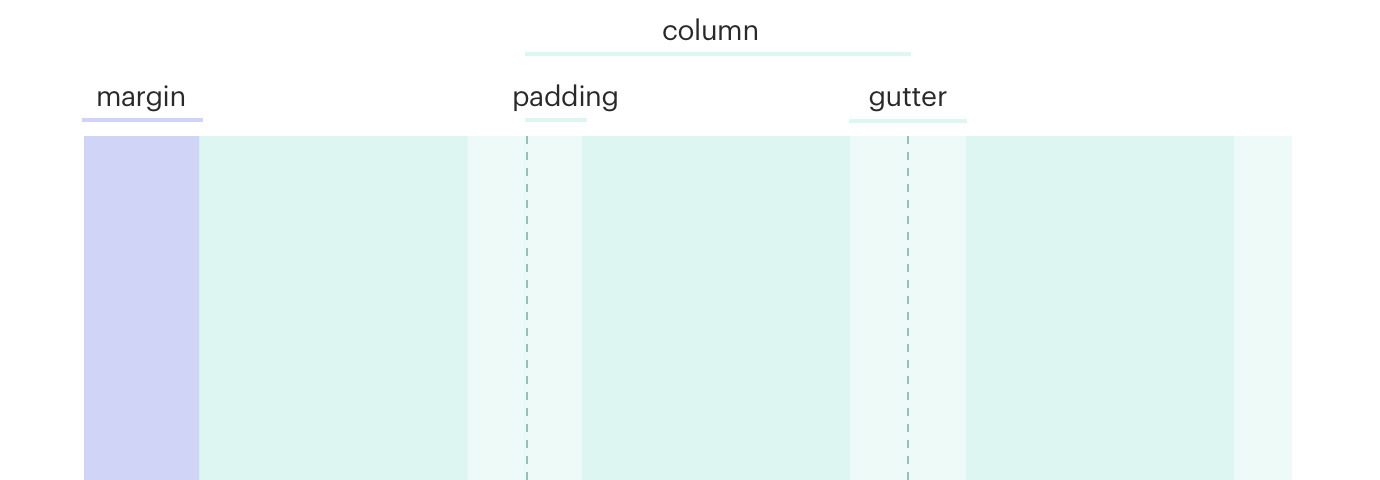
CdrGrid applies a default responsive gutter which you can customize using the gutter prop, or override completely using CSS.
| Type | Purpose |
|---|---|
| Column layout | Uses rows and columns to lay out content by specifying equal widths for all columns. Columns have a minimum width. |
| Justify | Defines x-axis alignment and distributes space for all columns per row. Containers may have set widths or may be flexible with max widths defined. This applies to all columns with left as the default value. |
| Align | Defines y-axis alignment per row and distributes space across all columns per row. This applies to all columns with stretch as the default value. |
| Gutter | Defines gutter size for all columns on a row and maintains gutter size by breakpoint. This applies to all columns. When this value is not set, default sizes are used. |
When to use
- Arranging content and components into rows and columns
- Laying out a page of two+ rows of body content (apart from site navigation), some of which may or may not have columns
- Applying responsive rules to columns of a row and/or regions of a page layout, or a container of many components
- Arranging elements within a single component with two or more zones, including those aligned to the left or right edge
When not to use
- Presenting a multi-row columnar data display, such as features or specs of a product. Instead, use tables ::
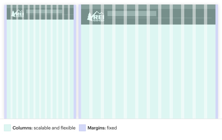
Columns, gutters, and margins scale in a fluid system as the device and viewport increases from small to large.
Anatomy
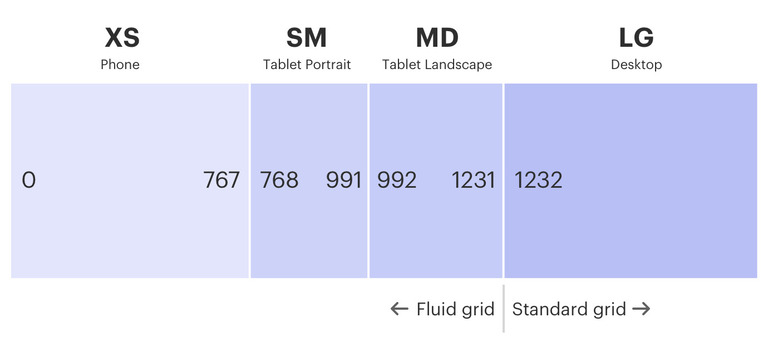
| Type | Padding | Gutter | Gutter |
|---|---|---|---|
| XS (extra small) | < 768px | 16px | 16 px |
| SM (small) | ≥ 768px | 16px | 16 px |
| MD (medium) | ≥ 992px | 32px | 32px |
| LG (large) | ≥ 1232px | 32px | 32px |
- Prioritize your content by organizing it to highlight the most important information
- Use white space created by grid system—too much dense information can be disorienting and overwhelming
- Avoid breaking alignment or slightly oversizing a container to stick out for visual interest or to add emphasis
- Create relationships and hierarchy between content elements by using the margins and gutters in the grid shared by the page layout
Do maintain a consistent grid system.
Don't mix this grid and other grid systems.
Do maintain global margins.
Don't make margins too large.

Do maintain global gutters.
Don't make gutters too large.
Design mobile first:
- Use the XS (≤ 768px) viewport width applicable to small devices like a phone
- Start with a one column layout and add columns as needed
Other ways to build an effective responsive grid:
- Apply responsive media queries to the grid and its contained content at relevant breakpoints including SM (≥ 768px) and MD (≥ 998px)
- Complete and optimize the layout for the widest LG (≥ 1232px) viewport width
- Inspect responsive displays in between each breakpoint for how content responds across the fluid spectrum
Development responsibilities
When using this component, here's what you are responsible for:
- Allowing low-vision users to increase the size of the text by up to 200 percent without breaking the layout
- Ensuring the tab order for grid content makes sense. Avoid re-ordering the placement of items to differ from their order in the markup
- Using list markup for content layout. List markup allows content to be structured which makes it easier for assistive technologies
- Using order and the grid-placement properties only for visual, not logical, reordering of content. Style sheets using these features to perform logical reordering are non-conforming
CdrGrid functions as a grid container, and its immediate children are grid items.
- Use any native CSS grid properties on the CdrGrid or its grid items
- Use media queries to add responsiveness to your grid layout
- Wrap your entire page layout in a single
cdr-container
Scrolling grid
Create scrollable grids using the grid-auto-flow property set to column for horizontal scrolling or row for vertical scrolling.
<cdr-grid
  class="grid-2-example"
  style="overflow: scroll; grid-template-columns: 1fr 1fr 1fr; grid-auto-flow: column;"
>
  <div>some normal content</div>
  <div>short content</div>
  <div>some content that is longer</div>
  <div>short content</div>
  <div>some content that is much much longer</div>
  <div>some more content ...</div>
  <div>some more content ...</div>
  <div>some more content ...</div>
  <div>some more content ...</div>
  <div>some more content ...</div>
  <div>some more content ...</div>
  <div>some more content ...</div>
  <div>some more content ...</div>
</cdr-grid>
List markup
For accessibility reasons it may make sense to construct your grid using list markup.
<cdr-grid
  class="grid-2-example"
  tag="ul"
  style="overflow: scroll; grid-template-columns: 1fr 1fr;"
>
  <li>some normal content</li>
  <li>short content</li>
  <li>some content that is longer</li>
  <li>short content</li>
</cdr-grid>
Span
Control column width using the grid-template-columns property.
<cdr-grid
  class="grid-2-example"
  style="grid-template-columns: 1fr 2fr 4fr;"
>
  <div>1fr</div>
  <div>2fr</div>
  <div>4fr</div>
  <div>1fr</div>
  <div>2fr</div>
  <div>4fr</div>
</cdr-grid>
Complex span
Individual items can override their sizing with grid-column and grid-row
<cdr-grid
  class="grid-2-example"
  style="grid-template-columns: 1fr 1fr 1fr;"
>
  <div>1</div>
  <div>2</div>
  <div>3</div>
  <div style="grid-column: span 2; grid-row: span 3;">4</div>
  <div>5</div>
  <div>6</div>
</cdr-grid>
Offset
Create offsets on grid items using the grid-column-start property.
<cdr-grid
  class="grid-2-example"
  style="grid-template-columns: 1fr 1fr 1fr;"
>
  <div style="grid-column-start: 2;">1</div>
  <div>2</div>
</cdr-grid>
Nested grids
Nest grids to any depth by passing another CdrGrid in as a grid item.
<cdr-grid
  class="grid-2-example"
  style="grid-template-columns: 1fr 2fr;"
>
  <div>content</div>
  <cdr-grid style="grid-template-columns: 1fr 2fr;">
    <div>content</div>
    <div>content</div>
    <div>content</div>
  </cdr-grid>
</cdr-grid>
Responsive grids
CSS grid layouts using fr units are inherently responsive. However, you can create additional breakpoint-specific behaviors using media queries.
<cdr-grid class="grid-2-example responsive-grid-example">
  <div>content</div>
  <div>content</div>
  <div>content</div>
  <div>content</div>
</cdr-grid>
.responsive-grid-example {
  grid-template-columns: '1fr 1fr 1fr';
  @include cdr-md-mq-down {
    grid-template-columns: '1fr';
  }
}
Handling leftover columns
For grid layouts with an unknown number of items you may end up with an incomplete row at the end. Style these "leftover" columns using a combination of the last-child/nth-last-child and nth-child selectors depending on how many items are in your grid row.
<cdr-grid
  class="grid-2-example orphan-grid-example-2x2"
  style="grid-template-columns: 1fr 1fr;"
>
  <div>content</div>
  <div>content</div>
  <div>content</div>
</cdr-grid>
/* Target leftover grid columns */

.orphan-grid-example-2x2 div:last-child:nth-child(2n + 1) {
  grid-column: 1 / span 2;
}
For grid layouts with an odd number of columns per row, make the grid-template and grid-items each twice as large so they can be offset as needed to center them.
<div>
  2 leftover columns:
  <cdr-grid
    class="grid-2-example orphan-grid-example-3x3"
    style="grid-template-columns: repeat(6, 1fr);"
  >
    <div>content</div>
    <div>content</div>
    <div>content</div>
    <div>content</div>
    <div>content</div>
  </cdr-grid>
  <hr />
  1 leftover item:
  <cdr-grid
    class="grid-2-example orphan-grid-example-3x3"
    style="grid-template-columns: repeat(6, 1fr);"
  >
    <div>content</div>
    <div>content</div>
    <div>content</div>
    <div>content</div>
  </cdr-grid>
</div>
/* Make grid columns take up twice as much space */
.orphan-grid-example-3x3 div {
  grid-column: span 2;
}

/* If 2 columns are leftover, center them by moving the second to last element to the right by 1 */
.orphan-grid-example-3x3 div:nth-last-child(2):nth-child(3n + 1) {
  grid-column: 2 / span 2;
}

/* If 1 column is leftover, center it by moving it to the right by 2 */
.orphan-grid-example-3x3 div:last-child:nth-child(3n + 1) {
  grid-column: 3 / span 2;
}
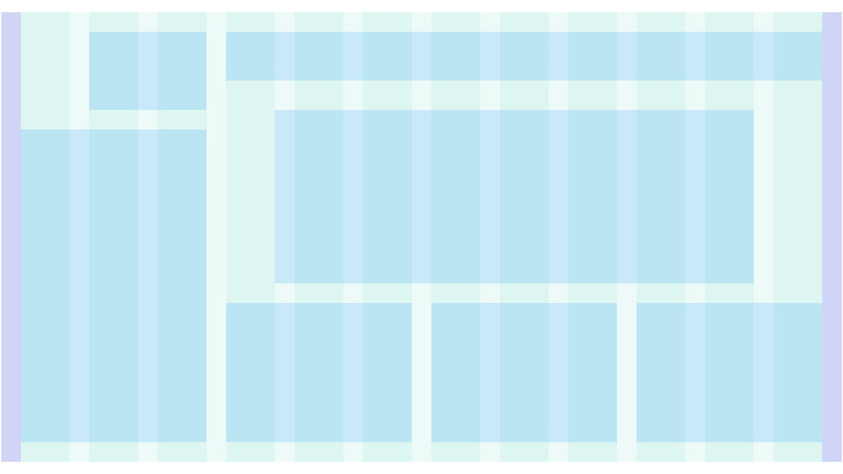
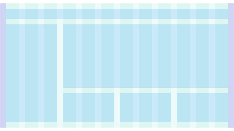
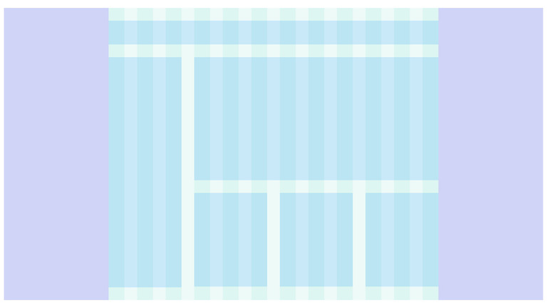
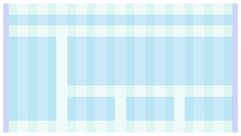
Named grid areas
Use grid-template-areas to layout grid items named using the grid-area property.
<cdr-grid
  class="grid-2-example"
  style="grid-template-areas: 'logo header header header' 'content content content sidebar' 'footer footer footer footer';"
>
  <div style="grid-area: logo;">logo</div>
  <div style="grid-area: header;">header</div>
  <div style="grid-area: content;">content</div>
  <div style="grid-area: sidebar;">sidebar</div>
  <div style="grid-area: footer;">footer</div>
</cdr-grid>
CdrGrid
Props
| Name | Type | Default |
|---|---|---|
gutter Defines gutter size, accepts responsive values | string | medium@xs medium@sm large@md large@lg |
tag Sets the HTML tag for the grid element | Tag | 'div' as Tag |
Slots
| Name |
|---|
default CdrGrid content (grid child elements) |