input
Allows for data entry, editing, and search
Make sure inputs are:
- Identifiable: Input fields indicate that users can enter information
- Findable: Input fields are easy to find among other elements
- Legible: Input fields indicate their state such as enabled, focused or disabled
Options
- Define width using CSS styles
- Height options are medium or large
- Ability to specify field type for text, email, number, password, search and URL
Multi-line input fields
Use when long free-form text is the desired user input such as a comment on a review or feedback form.
Notes about behavior:
- Overflow text wraps to a new line
- Scroll bar appears on right border when cursor reaches the bottom of the field
- Defined by setting the number of rows for a recommended response length
- Resizing handle allows user to change the height of the input area
Min and max limits are set by the product team for:
- Max-height of text area
- Maximum and minimum number of characters
Do limit the width of the input field.
Don't make the input field wider than approximately ⅓ of the information being entered.
Do use consistent sizes for components on a single form.
Don't mix sizes for components on a single form.
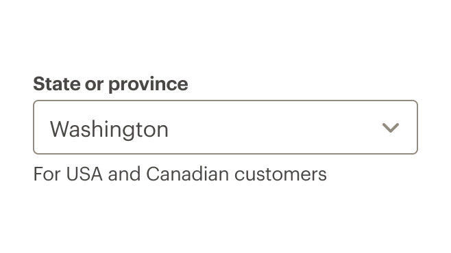
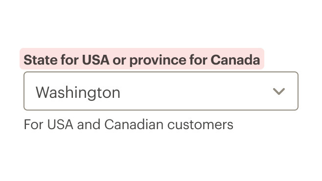
Labels
- Limit labels to 1–3 words and fewer than 20 characters, including spaces.
- Use sentence case. Do not use all caps, title caps, or all lowercase.
Do use concise and meaningful labels.
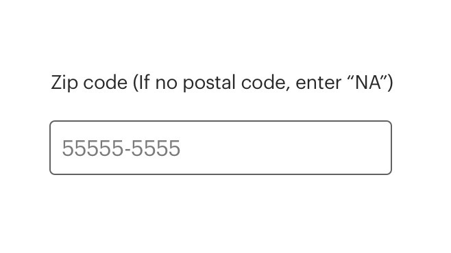
Don't use instructional or help text for the label.
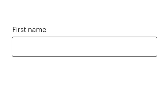
Do use sentence case for labels.
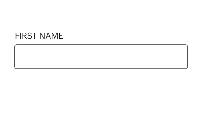
Don't use all caps for labels.

Do remove unnecessary terminal punctuation such as semicolons, colons or periods.

Don't use colons after labels.
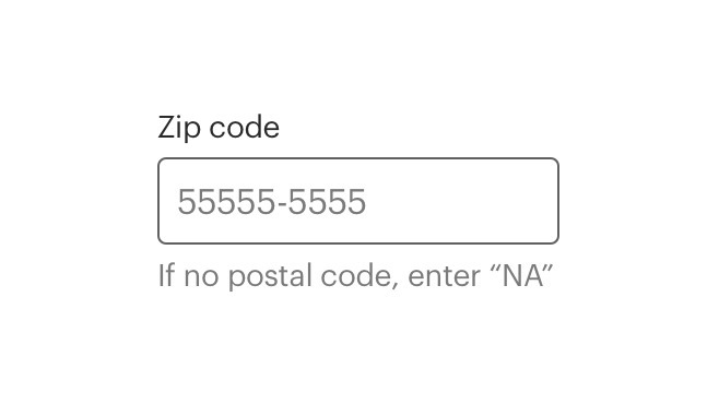
Helper text
- Use helper text for hints or suggestions
- If help text is long or complex, use an icon or link above the input box
- Too much helper help text can make a form look and feel difficult to use
Icons
Use icons to trigger a popover for hints or suggestions.
Link text
- Use a link when moving or navigating to another page or to a different portion of the same page
- Use a link if navigating the user to long or complex information
Default input attributes
CdrInput sets some default attributes to make it easier to construct consistent and accessible forms. You can override these default attributes by passing the same attribute to the CdrInput component.
For all CdrInput elements:
spellcheckis set tofalseautocorrectis set tooffautocapitalizeis set tooff
For CdrInput elements with type="number" set, these attributes are enabled to help ensure that numeric inputs behave consistently across browsers and devices:
patternis set to[0-9]*, which restrictsnovalidateis set totrueinputmodeis set tonumeric
<!-- restrict numeric input to 3 characters max with a listener -->
<cdr-input
  type="number"
  v-model="default"
  @input="() => {this.default = this.default.substring(0, 3)}"
/>

<!-- restrict numeric input to 3 digit numbers -->
<cdr-input
  type="number"
  v-model="default"
  min="0"
  max="999"
/>
Input masking
Automatically format user input to make forms easier to comprehend and use. For example, add parentheses and a dash to a phone number or insert a space between every four digits of a credit card number.
We have not integrated input masking integrated directly into Cedar. However, the CdrInput component implements the same API as a plain HTML text input element. Use it in conjunction with most input masking libraries.
We recommend using v-mask as a local directive in any components where you need input masking. Some benefits:
- It’s one of the smallest Vue plugins for input masking
- Can be loaded as a local directive directly in your component rather than as a global plugin that must be registered at the application level
- The API of
v-maskis extremely simple and easy to understand - If and when input masking support is built into CdrInput the v-mask API is what we will implement, making it easier for you to migrate in the future
<script>
import { CdrInput } from "@rei/cedar";
import { VueMaskDirective } from "v-mask";

export default {
  name: "VueDirectiveExample",
  components: {
    CdrInput,
  },
  directives: {
    mask: VueMaskDirective,
  },
  data() {
    return {
      defaultModel: '',
    }
  }
};
</script>
<template>
<cdr-input
  v-model="defaultModel"
  type="tel"
  v-mask="'(###) ###-####'"
>
</template>
Inputs with icons
Icons inserted into input fields are decorative, not intended for any action.
Required fields
- The default status of an input field is “optional.” Setting the
optionalprop on the input will render a text label indicating it is optional - If the status is set to “required,” an asterisk will appear next to the input label with an aria-label indicating that the input is required. The input field is marked
aria-required
What Cedar provides
- Requires a value for the
labelfield - When hiding a label, the
aria-labelattribute is set to thelabelvalue
Development responsibilities
When using this component, here's what you are responsible for:
Don’t use the HTML placeholder attribute. It creates an inaccessible experience when the placeholder content disappears as soon as the user begins typing into the input field. Instead, use the helper-text-top, helper-text-bottom or info slots to provide any additional information needed to complete the input.
Any additional actionable elements related to the input field should indicate their function and relationship through their text content, aria-label or a tooltip
These actionable elements may be:
- External to the input component
- Passed in via the
info,info-actionorpost-iconslots
For projects that cannot make use of the Vue.js component, the CdrInput styles are available through the @rei/cdr-component-variables package as SCSS mixins. These can be applied to plain HTML elements. See examples on the component variables page. Note that the cdr-label-standalone mixins should be used for assembling the label element.
Validation
An input field with validation runs on blur. Error state is controlled with the error prop. Setting the error prop to a string will render that message with default error styling. Use the error slotto fully customize the error message.
<cdr-input
  v-model="defaultModel"
  :background="backgroundColor"
  label="Input label"
  :error="modelError"
  aria-describedby="errorMessage"
  @blur="validateInput"
>
  <template #helper-text-bottom>Must be 4 or less characters</template>
  <template #error>
    <span id="errorMessage">Error: please enter 4 or less characters</span>
  </template>
</cdr-input>
CdrInput
Props
| Name | Type | Default |
|---|---|---|
id Custom ID that is mapped to the label ‘for’ attribute. If this value is not set, it will be randomly generated. | string | |
type 'type' attribute for the input as defined by w3c. Only supporting text|email|number|password|search|url|date|datetime-local. The increment/decrement webkit psuedo element is hidden for number. Possible values: text, email, number, password, search, url, tel, date, datetime-local | string | text |
label Required Sets the text value for the input label. Required for a11y compliance. Use ‘hideLabel’ if the label display is not desired. Required. | string | |
numeric Sets default attributes for an input that should launch a numeric keyboard but is not strictly a 'number' (credit card, security code, postal code, etc.). Should be used in conjunction with the default text type input. An `input` listener can be used to fully restrict input values to numerical characters only | boolean | false |
hideLabel Removes the label element but sets the input `aria-label` to `label` text for a11y. | boolean | |
rows Number of rows for input. Converts component to text-area if rows greater than 1. | number | 1 |
background Sets the background color the input is rendered on Possible values: primary, secondary | backgroundProps | |
size Sets the input field size Possible values: large | string | |
errorRole Sets the `role` attribute for the embedded error state messaging. | string | status |
error Sets the input to an error state, displays the `error` slot if one is present. | boolean|string | false |
disabled Sets the disabled state for the input field and label styling. Also, restricts user input. | boolean | |
required Sets aria-required on the input field and displays an asterisk next to the input label. | boolean | |
optional Displays '(optional)' text next to the input label. | boolean | |
modelValue
| string|number | |
inputContainerClass Adds a custom class to the cdr-label-standalone container div | string | |
labelClass Passes a custom class to the label for custom styles | string |
Slots
| Name |
|---|
helper-text-top Helper text above the input field |
info Link or icon to the right above the input field. |
pre-icon Icon preceding text within the input field |
post-icon Icon after text within the input field |
info-action Action-wrapped icon within the input field (precedes post-icon) |
helper-text-bottom Helper text below the input field |
error Error messaging text that is displayed when the `error` prop is true. |
Events
| Name | Parameters |
|---|---|
update:modelValue Event emitted by v-model on the <input> element | modelValue |