breadcrumb
CdrBreadcrumb - Navigation used to reveal a page's location within the site hierarchy Provides a hierarchical navigation trail to help users understand their current location and navigate back to parent pages. Supports automatic truncation for long breadcrumb trails.
| Type | Purpose |
|---|---|
| Truncated (default) | Long breadcrumb path shortened to display the last 2 items with hidden links indicated by ellipsis. |
| Untruncated | Complete breadcrumb string for makeing all items visible. |
| Custom navigation | Used to override the default link navigation behavior inside a breadcrumb. |
When to use
- Helping users understand where they are within the site hierarchy
- Providing a shortcut to explore similar products within common parent categories
When not to use
- Displaying a top-level page, such as a home or high-level category page
- Linking to previous steps of a sequential process
Breadcrumbs provide context and a sense of place. This is especially important on a small screen, where other orienting content isn’t visible.
Make sure to:
- Include the full location path data once and only once in the code
- Display the complete breadcrumb path—not just the previous item—when an ellipsis is clicked or tapped
- When full breadcrumbs path is displayed, it may wrap to 2 or more lines
- Avoid displaying breadcrumbs on non-white backgrounds
- Refer to API documentation for how to customize breadcrumb truncation width
- Always retain the full location path in page markup, even if shortened due to responsive styling

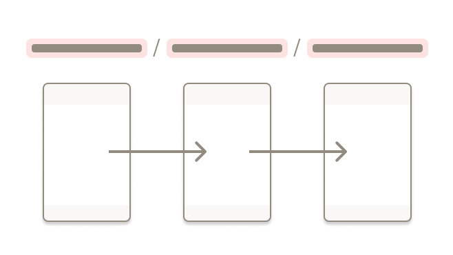
Do show the full path for breadcrumb items whenever possible.
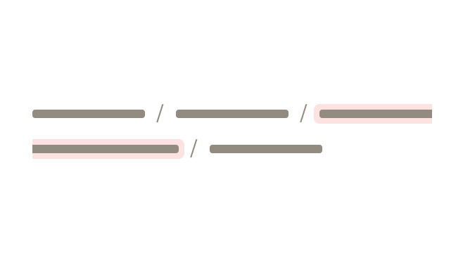
Don't show the path the user takes to arrive at a page.
Truncation
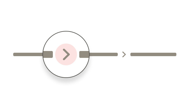
Indicate hidden links using an ellipsis.

Truncate breadcrumbs left to right to show the final two links in the trail, so that at least the parent and grandparent are always visible.

Do use truncation for breadcrumb path.
Don't break the page title when long breadcrumb path is expanded.
Avoiding customization
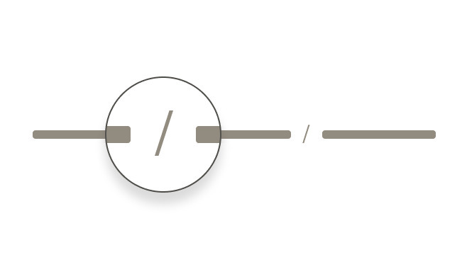
Do separate breadcrumb items with the "/" symbol, automatically added in CSS.
Don't create a custom symbol to separate breadcrumb items.
Do use gray color tints for breadcrumb items.
Don't color breadcrumb items blue
- Always align breadcrumb labels with the destination page names
- Incorporate keywords into page names and breadcrumbs to improve SEO
- Align breadcrumb labels with words customers use while searching for products, events, adventures, or expert advice
- Never include the current page in a breadcrumb path. Instead, display it only as a page title
For items in multiple categories with no identified primary path, display the most relevant path:
- If an article lives in both Hiking and Camping, and the user browsed to the article through Hiking, show the breadcrumb that includes Hiking
- If the user browsed to the same article through Camping, show the breadcrumb that includes Camping
- If the user landed on the article from a Google search, show either category as a breadcrumb

What Cedar provides
- Text color with a Level AA contrast ratio of 4.5:1 contrast between the text color and the background, but only when displayed on light backgrounds
- The attribute
aria-label=\"Breadcrumb\"in the<nav>element to identify the structure ofcdr-breadcrumbas a breadcrumb path for assistive technologies - The ellipsis button contains the
aria-expanded="false"attribute for expanding the breadcrumb path - Focus on the first breadcrumb item when the ellipsis button is clicked
Development responsibilities
When using this component, here's what you are responsible for:
- Indicate the current page location within a hierarchy using breadcrumbs
- Don’t include the current page in breadcrumb path because the
aria-currentattribute is not defined for the last item
For projects that cannot make use of the Vue.js component, the CdrBreadcrumb styles are available through the @rei/cdr-component-variables package as SCSS mixins. These can be applied to plain HTML elements. See examples on the component variables page
The items property requires an array of objects. Notable values include:
item.url(optional) string where the breadcrumb item segment links when clicked or tappeditem.name(required) string for the breadcrumb text item segment
The array must be ordered appropriately from low index rendered on the left, to high index on the right.
Alternatively, you can set items using an array literal:
<cdr-breadcrumb
  :items="[
    { item: { url: '', name: 1 } },
    { item: { url: '', name: 2 } },
    { item: { url: '', name: 3 } },
  ]"
/>
Use truncationEnabled to disable the truncation functionality:
<cdr-breadcrumb
  :truncation-enabled="false"
  :items="[
    { item: { url: '', name: 1 } },
    { item: { url: '', name: 2 } },
    { item: { url: '', name: 3 } },
  ]"
/>
When using CdrBreadcrumb in a TypeScript application, we recommend importing the breadcrumbItem interface from the library so you can correctly define the component props.
CdrBreadcrumb expects an array of objects with a specific schema, so using this interface will prevent you from needing to define your own. Using a helper extension In VS Code, like Volar, will give you helpful hints when importing this interface as well.
ParentComponent.vue
<script setup lang="ts">
import { CdrBreadcrumb, type breadcrumbItem } from '@rei/cedar';

// CdrBreadcrumb expects an array of breadcrumbItems passed to the items property
defineProps({
  breadcrumbs: { type: Array<breadcrumbItem>, default: () => [] },
});
</script>

<template>
  <main>
    <CdrBreadcrumb :items="breadcrumbs" />
  </main>
</template>
CdrBreadcrumb
Props
| Name | Type | Default |
|---|---|---|
items Required Array of breadcrumb items | Array | |
truncationEnabled Enables truncation of breadcrumb items | boolean | true |
id Unique id for the breadcrumb | string |
Slots
| Name |
|---|
link |
Events
| Name | Parameters |
|---|---|
navigate | - |