link
Clickable text elements used for navigating to other pages or sections
| Type | Purpose |
|---|---|
| Neutral | Displays in the default color but can stack link modifiers. For example, you can use a neutral link plus the standalone variant together. |
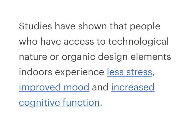
| Standalone | Displays independently with a call-to-action. Some examples for use include finding a store, or viewing related products. |
| Inline link button | Renders a button that looks like a link, using the tag prop. Should trigger an action rather than navigate to a new page. |
When to use
- Navigating to another page or a different portion of the same page #dont
- Navigating a user from promotional or campaign content. Instead, use a button styled to match the campaign ::
Choosing the right component
Links or buttons?
| Criteria | Link | Button |
|---|---|---|
| Answers the question | Where can I go? | What can I do? |
| Search engine crawlers | Can follow anchors for links | Cannot follow links that are submitted by input or button |
| Default keyboard behavior | Triggered using the Enter key | Triggered using the Space or Enter key |
| Disabled | Cannot be disabled like buttons but can be made inert with tabindex=-1” and aria-hidden=“true” | Can be disabled with disabled attribute |
Links as anchors or buttons?
| Criteria | Link | Button |
|---|---|---|
| Navigating user to a new page or view | — | |
| Toggling a display to full screen | — | |
| Changing the URL | — | |
| Opening a modal window | — | |
| Causing a browser redraw or refresh | — | |
| Triggering a popup menu | — | |
| Supporting internal page jumps | — | |
| Can be disabled with disabled attribute | — |
When not to use
Link styles
- Link styles are adapted based on context, such as for links included in the breadcrumb component, menus and navigation
- Use the basic default link when the link is near a body of text or in appears in a body of text
- Use the basic standalone link when there is separation from a body of text
- To render a link that has the spacing and sizing of a button, use CdrButton with link modifier. To visually render a button that behaves like a link, use a CdrButton with link tag
- Link buttons are often useful for reducing the visual clutter of large groups of actions. For example, when there are many cards in a group use the link button style instead of a true button style
Do underline every link.
Don't apply different visual treatments for hyperlinks.
Behavior
When using multiple inline links together, make sure their behaviors are consistent. For instance, don't have one link go to a new page and another one in the group trigger an action.
- Use link labels that describe the destination when clicked or tapped
- Keep link text concise. Restrict link text length to a maximum of 100 characters
- Use descriptive text for links, so the user knows where they are going or what action they are taking
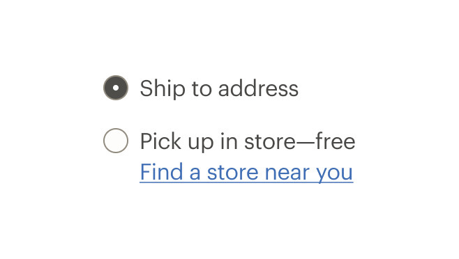
Do use clear, concise and descriptive text.
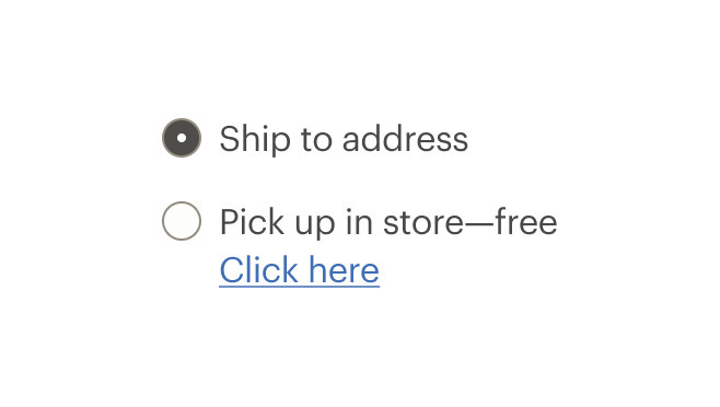
Don't use “click here” or “start here” for link text.
Writing for screen readers
If screen space for text is minimal and text is only “Learn more:"
- Provide
alttext for screen readers which includes more detail - For example, if the link text is “Learn more”, then the
alttext could be “Learn more about pick up in store” - Don’t capitalize links. Some screen readers read capitalized text letter-by-letter. Instead, use sentence case
What Cedar provides
CdrLink uses text color with a Level AA contrast ratio of 4.5:1 contrast between the text color and the background but only when displayed on light backgrounds.
Development responsibilities
When using this component, here's what you are responsible for:
- Always use a
<button>element for thetagprop when there is nohrefattribute to apply to the link. Use when toggling a display to full screen, opening a modal window, triggering a popup menu and playing media content - Always use the default
<a>element for a link that navigates the user to the location specified by thehrefattribute - Make the purpose of each link understandable and distinguishable from other links on the same page, either from the link text alone, or from the immediate surrounding context of the link
- Restrict the number of text links on a page. Screen readers will read all the links on a page
Text
- Apply programmatically-discernible text
- Consistently identify links to the same destination with the same (or very similar) link text across all pages of the site
- Avoid using only “Click here” or “Start here”
- Use
aria-labeloraria-labelledbyto provide a more descriptive name when the text content of the link cannot be changed - If screen space for text is minimal, provide text that can be read by screen readers
- If screen space for text is minimal, use an inline element for hidden text with the
cdr-sr-onlyclass
<cdr-link>
    Start here <span class="cdr-sr-only">for help finding the proper sleeping bag </span>
  </cdr-link>
Assistive technology
- Ensure assistive technology can find all links on a page
- Always provide a
hrefattribute. Emptyhrefattributes are not considered true links and are not accessible to keyboard users - When using images as links, the
altattribute acts as the link text. Describe the action or hyperlink that the image represents - Ensure keyboard focus can be moved to a component or away from it using only a keyboard interface
- Advise users of alternate methods for moving keyboard focus away if it requires more than unmodified arrow or tab keys or other standard exit methods
For projects that cannot make use of the Vue.js component, the CdrLink styles are available through the @rei/cdr-component-variables package as SCSS mixins. These can be applied to plain HTML elements. See examples on the component variables page.
By default, the component renders using an anchor element and requires an href attribute to render a valid, accessible link.
<cdr-link href="http://rei.com">
    Visit REI
  </cdr-link>
Use the tag prop to render the link as a <button> element that appears as a link, but without an href attribute.
<cdr-link tag="button">
    Show Details
  </cdr-link>
CdrLink
Props
| Name | Type | Default |
|---|---|---|
tag Sets valid HTML element tag | CdrLinkTag | a |
href Sets value for anchors href property. Requires tag prop value to be `a`. | string | # |
inheritColor Sets color and fill | boolean | false |
modifier Modifies the style variant for this component. | LinkModifier | |
target
| string | |
rel
| string |
Slots
| Name |
|---|
default Readable text of the link |