card
CdrCard - Related, interactive containers linking to a single subject or destination Cards are flexible containers for grouping related content and actions. They serve as an entry point to more detailed information and can contain various types of content including images, text, links, and buttons.
When to use
- Previewing bite-sized information about an article or activity, such as a class or event
When not to use
- The content doesn't link to a destination or it doesn't contain any actionable elements
- Displaying search results
- The information contained within the card is not related
- The visual presentation of a card is needed, but not the interaction pattern ::
Behavior
A card is a linked container with several pre-defined behaviors:
- Cards have a defined background color
- Cards resemble physical cards in that they have a defined area and visually sit above the background
- Cards are interactive and respond to a user's input by "lifting" off a page's background
Composition
Compose cards by using several different components. These components work together to provide details about a singular subject or destination.
For groups of cards:
- Separate each card by using the grid system
- Ensure you are using consistent components from card to card
- Use the same height and width for each card on the page
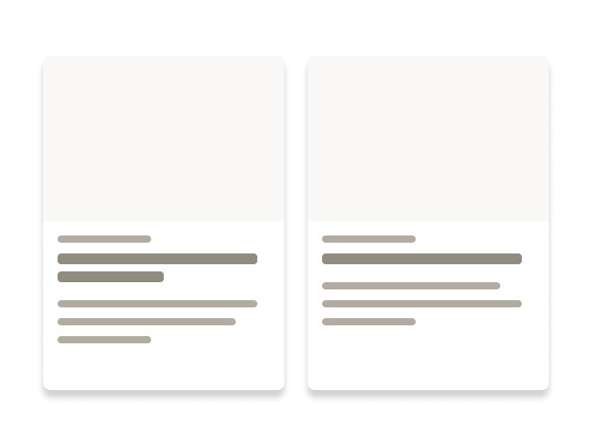
Do use consistent elements from card to card when arranged in groups.
Don't group unlike cards that use different elements.
Do include essential, summarized information.
Don't overwhelm the space with excessive content.
What Cedar provides
- Semantic HTML: The component uses semantic HTML elements, such as
<header>and<footer>, to provide meaningful structure to screen reader users - Keyboard navigation: People can navigate the card component using the keyboard, allowing users to focus on different parts of the card
- Screen reader support: The card component is announced to screen reader users and its content is read out loud, making it accessible to users with visual impairments
Development responsibilities
When using this component, here's what you are responsible for:
- Leave the default tag prop of
articleif the content includes a heading and the content would be as useful on another web page - Set the tag prop to
sectionif the content contains a heading, but the content is dependent on its context to be meaningful - Set the tag prop to
divif your card title won’t be using a heading tag. This ensures it will not appear in the document’s outline - Ensure CdrCard contains a linked title
- All actionable elements contained within CdrCard must follow the guidelines outlined within their accessibility sections
- Provide descriptive text: Write descriptive and concise text, making it easier for screen reader users to understand the card’s content
- Avoid using decorative images: Screen readers will not announce purely decorative images
- Provide alternative text for images: Describe the image (using the alt attribute) for screen readers to announce to user
For projects that cannot make use of the Vue.js component, the CdrCard styles are available through the @rei/cdr-component-variables package as SCSS mixins. These can be applied to plain HTML elements. See examples on the component variables page.
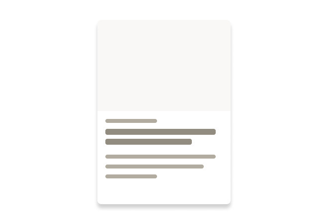
CdrCard is a simple wrapper component used to compose various card layouts.
Always use cards to link to other content. Use the cdr-card__link utility class on the link element to ensure the entire card functions as a click target.
<cdr-card>
  <div>
    <cdr-img
      alt="card test image alt text"
      src="/rei-cedar-docs/live.jpg"
      modifier="responsive"
    />
  </div>
  <div class="content">
    <cdr-link
      class="cdr-card__link"
      href="#Overview"
    >
      <cdr-text
        tag="h4"
        class="title"
      >
        Complex Card Title
      </cdr-text>
    </cdr-link>
    <cdr-rating
      rating="4.2"
      count="12"
      size="small"
    />
    <cdr-text class="body">Card content</cdr-text>
  </div>
</cdr-card>
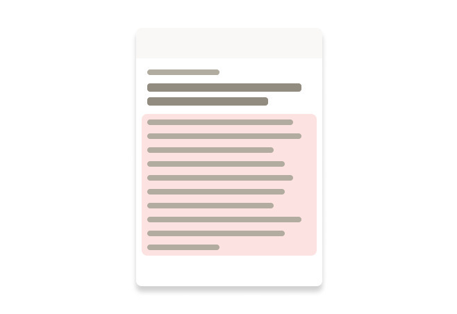
Customizing cards
Because CdrCard is a simple wrapper component, you can customize or override its behavior in several ways. For example, add a border or inset padding, or modify the link behavior.
<cdr-card class="custom-card-example">
  <div>
    <cdr-img
      alt="card test image alt text"
      src="/rei-cedar-docs/live.jpg"
      modifier="responsive"
    />
  </div>
  <div>
    <cdr-link
      class="cdr-card__link"
      href="#Overview"
    >
      <cdr-text
        tag="h4"
        class="title"
      >
        Custom Card Title
      </cdr-text>
    </cdr-link>
    <cdr-rating
      rating="4.2"
      count="12"
      size="small"
    />
    <cdr-text class="body">Card content</cdr-text>
  </div>
</cdr-card>
<style>
  .custom-card-example {
    /* Custom styles here */
  }
</style>
CdrCard
Props
| Name | Type | Default |
|---|---|---|
tag Sets valid HTML container element tag | Tag | 'article' as Tag |
Slots
| Name |
|---|
default CdrCard content |