Palettes
Tailored color experiencesUse Cedar palettes to highlight special content, or adapt certain areas of your experience to seasonal or campaign-based needs.
Cedar palettes allow you to apply cohesive, theme-like variations to specific sections of your application without altering the underlying components or global design foundation. All Cedar CSS tokens and components within a section automatically receive updated color values defined by the chosen palette.
Palettes are enabled via a refactor of tokens and Cedar components to use CSS Custom Properties for color definition.
Apply a palette by either:
- Using the Cdr-Surface component and passing a supported palette to the palette prop
- Applying a designated
data-paletteattribute to a container element
Integrating Cedar palettes
Start by importing the Cdr-palette.css asset to make sure you're using Cedar-supported and maintained palettes. This file provides access to a range of pre-defined palettes that align closely with Cedar’s core design principles and token structure.
@import 'path/to/cedar/cdr-palette.css';
[data-palette='membership-subtle'] {
  --cdr-color-background-primary: var(--cdr-membership-subtle-color-background-primary, #{$cdr-membership-subtle-color-background-primary});
  --cdr-color-text-primary: var(--cdr-membership-subtle-color-text-primary, #{$cdr-membership-subtle-color-text-primary});
 ...
}
It's important to understand that the CSS custom property function var() accepts two values, a name, and a declaration (or fallback) value. That fallback value can be a var() unto itself. This is called a compound fallback.
With that info, we can break things apart and expose the magic.
--cdr-text-color: This is our custom property name that is exposed to a palette. Pass this variable with a value to recolor CdrText components within a page.
--cdr-color-text-primary: If name is undefined, the browser will first check if this property is defined. This value maps directly to the Cedar token value and comes from a new a tokens export. By including this, you can globally change the definition of cdr-color-text-primary (and other tokens) in your palette.
#{$cdr-color-text-primary}: If both the name and our initial fallback is undefined the component falls back to the compiled scss variable for the token. This preserves the ability for Cedar components to exist independently of tokens in your consuming apps (i.e. it avoids creating a contract between tokens and components where tokens is required for components to function).
<cdr-surface data-palette="membership-subtle">
  </cdr-surface>
- Enhanced flexibility: Palettes help you to adopt stylistic changes at a section or component level without wrestling with a component’s underlying CSS. Forget complicated overrides — just select the appropriate palette and apply it to the container
- Unified language: Palettes adhere to established naming conventions and rely on existing tokens, contributing to a shared design vocabulary. This simplifies communication between designers, developers, and stakeholders
- Reusability opportunities: A well-defined palette can be reused across different projects and teams. Once you find a successful variation, it can serve as a design pattern elsewhere
- System integrity: Palettes let you remain within the Cedar design system. Rather than creating custom components that might drift from brand guidelines, palettes allow you to easily alter the colors of Cedar parts while using the component without any other alteration
- Future-proofing: Because palettes are built on Cedar’s global token structure, they easily accommodate future brand changes. Whether introducing new brand colors or evolving existing ones, your palettes automatically inherit those updates — no tedious refactoring required.
When to use
- Creating a unique visual mood for a specific site section (like a product gallery or a seasonal campaign landing page)
- Adjusting the color profile of an entire site or a substantial section to achieve a theme-like experience
When not to use
- Introducing a new palette for only minimal color adjustments—instead use existing tokens or modes to make minor tweaks ::
- For a seamless flow of brand updates into your palettes, reference and reassign established Cedar tokens rather than creating new ones
- Start with Cedar’s curated palettes to guarantee support, reduce duplication, and align with the system’s evolution
- For simpler maintenance and handoffs, keep clear and updated documentation around token overrides and the rationale behind them
- Don't embed raw brand hex values directly into palettes. Instead, map them through global tokens. This way global changes are automatic
- Avoid introducing tokens not defined by Cedar’s core set. This keeps palettes lightweight and compatible with ongoing Cedar updates
- Palettes require ongoing care. Avoid creating them if you aren’t prepared to maintain them in step with Cedar’s evolving brand and design tokens
- Introducing too many specialized palettes can fragment your design language. Keep them focused and purposeful to ensure a cohesive Cedar experience
What to keep in mind
What to watch out for
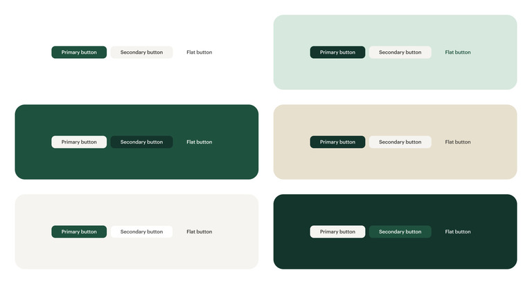
Membership vibrant palette
| color | assigned to |
|---|---|
| primary background | |
| primary text | |
| link: rest, hover, visited | |
| primary button background: rest, active | |
| primary button text: hover | |
| primary button border: rest, hover, visited |
<template>
  <cdr-surface palette="membership-vibrant">
    <cdr-body></cdr-body>
  </cdr-surface>
</template>
Membership subtle palette
| color | assigned to |
|---|---|
| primary background | |
| primary text | |
| link: rest, hover, visited | |
| primary button background: rest, active | |
| primary button text: hover | |
| primary button border: rest, hover, visited |
<template>
  <cdr-surface palette="membership-subtle">
    <cdr-body></cdr-body>
  </cdr-surface>
</template>
membership-vibrant
paletteA palette can change the color values of contained Cedar custom properties or compnents.
This theme updates the default palettes primary background color, primary text color, as well as the link component colors , and the colors for our
membership-vibrant
palettemembership-subtle
palette To use a Cedar palette, use the Cedar Surface component applying the palette name to the palette prop. Alternitivly, add a data-palette="palette-name" attribute to any containing element.