popover
Small overlay used to display contextual information
CdrButton,CdrIconA popover is a floating container useful for communicating small amounts of clarifying information. It's revealed when acting upon a trigger, like a button. You can also use it to preemptively bring attention to new interface features.
Messaging scenario examples:
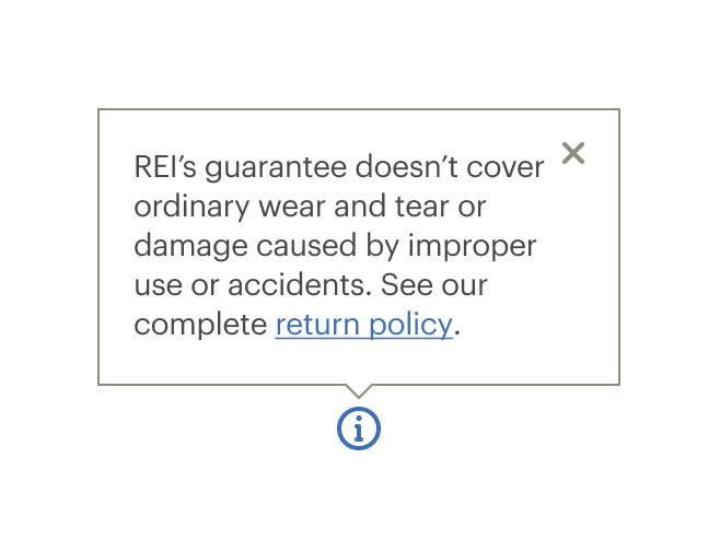
- The co-op requests a user’s email, so a popover is used to explain why an email is required and the ways in which it might be used
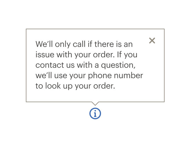
- Some users aren’t familiar with a credit card security field. Use a popover to describe specifically where to find the information we’re requesting for the identified card type
Do link to additional content within a popover if additional information might be needed.

Don't overload the popover with too much content.
Do provide users with additional information in a popover when a feature or task might need clarification.

Don't put information that's essential for completing a task in a popover.
What Cedar provides
- Adds click handler to the trigger element managing the popover state
- When opened, focus moves to the first actionable element inside the popover
- When closed, focus is restored to the last active element before the popover was opened
- Dynamically sets
aria-controlson the trigger element to point to the tooltip’sid - Sets
aria-haspopup="dialog"on the trigger element - Dynamically sets
aria-expandedon the popover content - Adds
role="dialog"to the tooltip content", - Ensures popover content is not visible to screen readers when it is closed
- Allows popovers to be closed by pressing the close button in the top right corner, by pressing the
esckey, or by clicking anywhere outside of the popover content
Development responsibilities
When using this component, here's what you are responsible for:
- Set an
idproperty on the CdrPopover. The component will automatically link thatidto the trigger element - Content passed into the
triggerslot must be an actionable element such as a button - Be aware that popovers can contain complex content structures such as headers, lists and actionable items. These provide related additional content to the section of the triggering element
CdrPopover is a wrapper component that accepts a trigger element and popover content. When the trigger element is clicked, the popover content is rendered.
Event bindings between the trigger and the popover are set up automatically. The popover will dynamically update its position property to ensure that it renders on screen. Disable this functionality by setting autoPosition to false.
Custom trigger
You can also control CdrPopover controlled programmatically using the open prop. However, doing so means that you must implement certain behavior yourself:
- The CdrPopover element and the trigger element must be wrapped in a div with
position: relativeandwidth: max-content - The
openproperty should be toggled to true when the trigger element is clicked - You will need to add an event listener on the CdrPopover element for the
@closedevent. In the following example we use@closed="open = false"to change the value passed to theopenprop - The trigger element should have its
aria-controlsproperty set to the ID of the CdrPopover, and it'saria-haspopupproperty set to "dialog"
<div style="position: relative; width: max-content;">
  <cdr-button
    aria-haspopup="dialog"
    aria-controls="popover-custom-example"
    @click="open = !open"
  >
    Click me
  </cdr-button>
  <cdr-popover
    id="popover-custom-example"
    position="top"
    :open="open"
    @closed="open = false"
  >
    <div>I provide additional information to the user</div>
  </cdr-popover>
</div>
CdrPopover
Props
| Name | Type | Default |
|---|---|---|
position Sets the position where the popover will render relative to the trigger element | PositionValue | top |
autoPosition If set to true, popover will attempt to dynamically set its position | boolean | true |
label Sets the title for the popover content. Can also be provided via the title slot | string | |
id Required ID for the popover element, required for accessibility | string | |
contentClass Add custom class to the popover content wrapper | string | |
open Used to programmatically control the popover state | boolean | false |
Slots
| Name |
|---|
trigger Slot for the element that triggers the popover. |
title Sets the title for the popover. Can also be set with `label` prop |
default |
icon |
Events
| Name | Parameters |
|---|---|
opened Emits when popover is opened | - |
closed Emits when popover is closed | - |