filmstrip
Responsive, accessible filmstrip for displaying a horizontal list of content frames.
CdrFilmstripEngineThe CdrFilmstrip component is a horizontally scrollable surface used to display a sequence of related content items within layout frames. It supports a variety of interaction patterns including keyboard navigation, touch scrolling, and controls.
Use it to highlight featured content, display product recommendations or other collections of similar frames.
When to use
- Presenting a horizontally scrollable list of related content, such as products, articles, or features
- Emphasizing a content sequence where visual preview is important
- Enabling users to browse multiple frames without navigating away from the current page
- Supporting keyboard and assistive technology navigation patterns
When not to use
- Displaying content items that require extensive reading or interaction within each frame
- Using for unrelated content that doesn’t benefit from visual alignment
- Relying on autoplay or continuous animation to convey critical information ::
Anatomy
The CdrFilmstrip consists of five main parts:
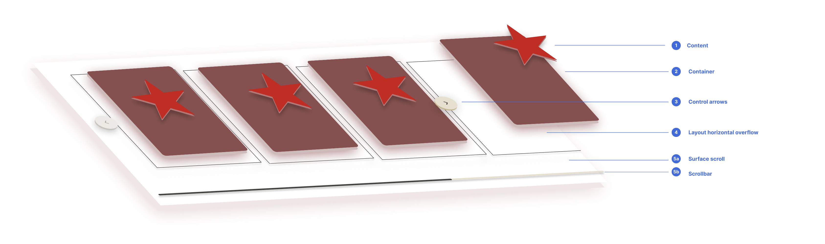
- Filmstrip controls: User controls that appear when hovering over the filmstrip, allowing navigation through the available frames.
- Item content: The content displayed within each frame, such as images, product data, or other visual elements. Each frame should contain similar types of content for consistency.
- Frame item: A container component, such as a
CdrSurfaceor a custom card, that holds the frame item content. - Frame layout: An unordered list layout that defines how frames are arranged within the surface scroll, including their size, spacing, and the number of frames shown at once.
- Surface scroll: The main container that holds the layout and all frames, managing horizontal overflow. Not all content is visible at rest; overflow frames are clipped. The
CdrSurfaceScrollcomponent includes a custom scrollbar for navigation and as a visual indicator, showing the user's position and the total available content.
CdrFilmstrip is highly flexible thanks to its adaptable layout and customizable appearance. No matter what content you choose, the component’s interaction behavior remains consistent because of its established framework.
Framing and layout
- Use a layout variant to control frame spacing, sizing, and the number of visible frames for optimal alignment and scanning
- Select the appropriate container component (
CdrSurface,CdrSurfaceNavigation, etc.) based on the desired interaction pattern. For example, useCdrSurfaceNavigationif clicking the entire frame should navigate the user, or use a nested interactive element (like a button or link) if only part of the frame should be interactive - Ensure a partial frame is visible at rest to indicate additional scrollable content
Content within frames
- Prioritize imagery or content that benefits from visual preview
- Keep frame content concise—avoid long-form text or interactive elements
- Use semantic heading structure and alt text for accessibility
- Standardize text truncation across all frames for visual alignment and consistency
Interaction and navigation
- Enable controls for quick navigation
- Enable scrollbar to indicate focus in the overflow layout
- Support keyboard focus management for accessibility
- Avoid using auto-scroll or looping behaviors unless they are user-initiated
Do maintain consistent frame dimensions and spacing.
Have a defined start and end point populated with related content.
Don't use frames with mixed sizes.
Populate with excessive or infinitely looping content.
Product recommendation example
This variant is an example of what you can create using filmstrip. It displays 6 frames per view. It doesn't need more than 5 clicks or swipes to view all the frames within it.
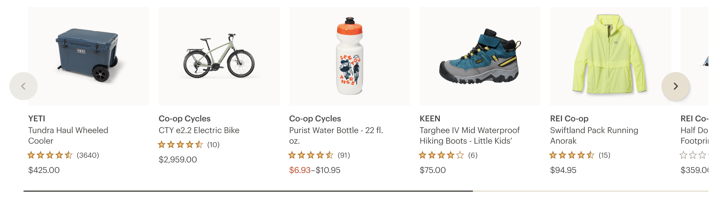
For more details about the product recommendation variant, visit our Figma Cedar community library.
- Curate frame content so each frame communicates a clear, scannable idea—use imagery, concise copy, or call-to-actions
- Keep frames consistent in structure to avoid visual clutter or cognitive overload
- Avoid overcrowding frames—leverage visual hierarchy, spacing, and alignment
- Ensure all interactive elements are clearly labeled and accessible
What Cedar provides
- Semantic roles: The filmstrip and its frames are rendered with appropriate roles and ARIA attributes to convey structure and intent
- Keyboard navigation: Users can navigate between frames using arrow keys and standard focus navigation
- Scroll announcements: When the filmstrip scrolls, updates can be announced to screen readers for better context
- Focus management: Focus is programmatically shifted when using provided controls to maintain usability and accessibility
Development responsibilities
When using this component, here's what you are responsible for:
- Ensure all content within each frame is meaningful and accessible via keyboard and screen readers
- Provide alt text for any images within frames
- Avoid including long-form or complex interactions that require nested focus management
- Ensure labels or headings are included where necessary to provide context
- Do not rely solely on scroll position or animation to convey important information
CdrFilmstrip is built around an adapter pattern to decouple data shape from presentation. Instead of requiring consumers to conform to a rigid prop structure, the filmstrip receives a model and an adapter function.
The adapter is responsible for transforming arbitrary input data into a standardized configuration that the filmstrip can render. This includes layout options, accessibility metadata, and a list of frame objects. By externalizing this logic, CdrFilmstrip stays agnostic to the data source and highly reusable across different contexts.
This approach promotes clear separation of concerns: data mapping lives in the adapter, and visual rendering is handled by the filmstrip itself.
The model
The model prop is the raw input passed to the adapter function. It can be any shape—ranging from structured CMS data to hand-authored JSON—depending on your application’s needs.
The adapter is responsible for interpreting this model and extracting the relevant values needed by the filmstrip: frames, layout settings, ARIA metadata, etc.
This abstraction allows authors to work with familiar data shapes while keeping rendering logic encapsulated in the adapter.
The adapter function
An adapter is a function that takes a raw data model and returns a structured configuration that CdrFilmstrip can render. This includes layout metadata, accessibility description, and an array of frame objects.
The adapter must conform to the CdrFilmstripAdapter<T> interface:
interface CdrFilmstripAdapter<T> {
  (modelData: unknown): CdrFilmstripConfig<T>;
}
The returned config must match the following structure:
interface CdrFilmstripConfig<T> {
  component: Component; // Vue component to render each frame
  frames: CdrFilmstripFrame<T>[]; // Array of frames (each has key + props)
  filmstripId: string; // Unique ID for ARIA and targeting
  description: string; // ARIA label for screen readers
  framesGap?: number; // Optional spacing between frames
  framesToShow?: number; // Optional number of visible frames
  focusSelector?: string; // Optional CSS selector to manage focus
}
This pattern gives you full control over how frames are shaped, rendered, and described—without hardcoding structure into the filmstrip component itself.
A minimal adapter might look like this:
import type {
  CdrFilmstripAdapter,
  CdrFilmstripConfig,
  CdrFilmstripFrame,
} from '@rei/cedar';
import FrameComponent, { type Frame } from './FrameComponent.vue';

/**
 * Adapter to transform raw model data into a structured filmstrip config.
 *
 * @param {unknown} model - The raw model data, expected to contain `items`.
 * @returns {CdrFilmstripConfig<Frame>} The filmstrip configuration.
 */
const adapter: CdrFilmstripAdapter<Frame> = (
  model,
): CdrFilmstripConfig<Frame> => {
  const { items = [] } = model as { items?: Frame[] };

  const frames: CdrFilmstripFrame<Frame>[] = items.map((item, index) => ({
    key: `frame-${index}`,
    props: item,
  }));

  const config: CdrFilmstripConfig<Frame> = {
    component: FrameComponent,
    frames,
    filmstripId: 'example',
    description: 'Example filmstrip',
  };

  return config;
};

export default adapter;
The frame
The component defined in the adapter is responsible for rendering each frame in the filmstrip. It receives the props defined in each CdrFilmstripFrame object and is treated like a standalone Vue component.
In the minimal adapter example above, each item from the model is passed as props to the frame. Here's a simplified version of a frame component:
<template>
  <div class="frame">
    <img
      :src="image.src"
      :alt="image.alt"
    />
    <a
      v-if="cta?.text"
      :href="cta.target"
    >
      {{ cta.text }}
    </a>
  </div>
</template>

<script lang="ts" setup>
export interface Frame {
  image: {
    src: string;
    alt: string;
  };
  cta?: {
    text?: string;
    target: string;
  };
}

defineProps<Frame>();
</script>
The frame component can contain any markup or layout needed to present the data. You are free to structure the props and visuals in a way that suits your use case, as long as it aligns with the shape returned from the adapter.
Events
CdrFilmstrip emits several events that allow you to respond to user interaction or layout changes. These events provide contextual data about the filmstrip’s state and are intended to help with analytics, focus control, dynamic updates, or external state management.
Common events
arrow-click: Fired when the user clicks one of the navigation arrows. Useful for tracking scroll direction and frame configuration.scroll-navigate: Fired when the filmstrip scrolls to a new frame. Includes the index of the target frame and model context.resize: Fired when the number of visible frames changes due to a screen or container resize. Can be used to dynamically adjust layout behavior.aria-message: Fired with a string message intended for screen readers to announce contextual changes.
Example: Listening to events
<CdrFilmstrip
  :model="model"
  :adapter="adapter"
  @arrow-click="onArrowClick"
  @scroll-navigate="onScrollNavigate"
  @resize="onResize"
  @aria-message="onAriaMessage"
></CdrFilmstrip>
function onArrowClick({ direction, event, model }) {
  console.log('Arrow clicked:', direction, event);
}

function onScrollNavigate({ index, event, model }) {
  console.log('Scrolled to frame index:', index);
}

function onAriaMessage(message: string) {
  console.log('Screen reader message:', message);
}
For dynamic frame layout, the resize event can be used to set framesToShow and framesToScroll based on screen width or breakpoint tokens. This enables responsive control while keeping layout logic outside the component.
import { CdrBreakpointMd } from '@rei/cedar';
import type { CdrFilmstripResizePayload } from '@rei/cedar';

function onResize(payload: unknown) {
  const {
    framesToScroll,
    framesToShow,
    model = {},
  } = payload as CdrFilmstripResizePayload;

  const width = document.body.clientWidth;

  if (width >= Number(CdrBreakpointMd)) {
    framesToShow.value = 3;
    framesToScroll.value = 2;
  }
}
Custom events
CdrFilmstrip supports custom events using Vue’s provide/inject API to enable communication across deeply nested component trees. This allows consumers to listen to or emit internal events without requiring direct parent-child relationships.
To emit a custom event from within a child component of the filmstrip, use the injected event emitter:
<template>
  <div
    class="frame"
    @click.prevent="onFrameClick"
  >
    <img
      :src="image.src"
      :alt="image.alt"
    />
    <a
      v-if="cta?.text"
      :href="cta.target"
    >
      {{ cta.text }}
    </a>
  </div>
</template>

<script lang="ts" setup>
import { inject } from 'vue';
import {
  CdrFilmstripEventEmitterKey,
  type CdrFilmstripEventEmitter,
} from '@rei/cedar';

export interface Frame {
  image: {
    src: string;
    alt: string;
  };
  cta?: {
    text?: string;
    target: string;
  };
}

const props = defineProps<Frame>();
const emitEvent = inject(CdrFilmstripEventKey) as CdrFilmstripEventEmitter;

const onFrameClick = (event: Event) => {
  emitEvent?.('frameClick', {
    event,
    item: props,
  });
};
</script>
This pattern gives users flexibility to coordinate behaviors across filmstrip descendants or integrate with external systems while maintaining encapsulation.
Example: Listening to a custom event
To handle a custom event like frameClick, add a listener directly on the CdrFilmstrip component and define the handler accordingly. Here's an example using the frameClick event emitted from a frame:
<template>
  <CdrFilmstrip
    :model="model"
    :adapter="adapter"
    @frame-click="onFrameClick"
  />
</template>

<script setup lang="ts">
function onFrameClick({ event, item }) {
  console.log('Custom frame clicked:', item);
}
</script>
Bringing it all together
A typical implementation might organize its filmstrip logic into a dedicated directory with the following structure:
custom-filmstrip/
├── Main.vue          # Entry point that imports adapter, frame, handlers
├── Frame.vue         # Vue component used to render individual frames
├── adapter.ts        # Transforms raw model data into filmstrip config
├── handlers.ts       # Event handlers like onFrameClick, onResize
├── index.d.ts        # Type declarations for frame props and model
This setup promotes a clean and modular architecture:
Main.vueacts as the primary integration layer, connecting data, layout, and events.Frame.vuedefines the UI and props for individual filmstrip items.adapter.tscentralizes transformation logic, abstracting data shape concerns.handlers.tsisolates side effects and shared event logic.index.d.tskeeps local types scoped and maintainable.
Example: Main.vue
Here’s a minimal example of how Main.vue might look, using the adapter, frame component, and event handlers:
<template>
  <CdrFilmstrip
    class="custom-filmstrip"
    :model="model"
    :adapter="adapter"
    @frame-click="onFrameClick"
  />
</template>

<script setup lang="ts">
import { CdrFilmstrip } from '@rei/cedar';
import adapter from './adapter';
import { onFrameClick } from './handlers';
import model from './mock.json';
</script>
This file acts as the entry point for rendering the filmstrip with custom data, components, and behavior. It ties together the core parts of your implementation while keeping responsibilities cleanly separated.
CdrFilmstrip
Props
| Name | Type | Default |
|---|---|---|
adapter Required
| CdrFilmstripAdapter | (): CdrFilmstripAdapter<Record<string, unknown>> => { return (): CdrFilmstripConfig<Record<string, unknown>> => { console.warn(`No adapter provided for CdrFilmstrip`); defineSlots<{ /** Optional injection of a heading element for the filmstrip */ 'heading'(props: Record<string, never>): any; }>(); return { frames: [], filmstripId: 'empty-filmstrip', component: h('div'), description: 'An empty filmstrip', }; }; } |
model Required
| T | (): Record<string, unknown> => ({}) |
Slots
| Name |
|---|
heading Optional injection of a heading element for the filmstrip |
Events
| Name | Parameters |
|---|---|
ariaMessage Emitted to update screen readers with the current frame information. | payload |
arrowClick Emitted when a user clicks the navigation arrows. | payload |
scrollNavigate Emitted when the filmstrip scrolls to a new frame. | payload |
resize Emitted when the layout changes due to screen or container resize. | payload |