chip
CdrChip - Allows people to make selections, filter content, or trigger actions Chips represent discrete pieces of information or actions. Use chips for tags, filters, or selections that users can interact with. Chips can contain text, icons, or both, and can be dismissible.
Chips allow users to make selections, filter content or trigger actions. While buttons are expected to appear consistently and with familiar calls to action, chips should appear dynamically.
| Type | Purpose |
|---|---|
| Default | Directly specifies, dynamically categorizes or immediately performs a discrete action. |
| Stateful | Updates settings immediately or triggers an immediate action while staying on the same page. |
| Filter | Adds a visual representation of user-selected filters. |
| Selection | Allows users to make a single select choice or a multiple select choice. |
When to use
- Dynamically categorizing content based on descriptive words
- Representing a checkbox group with more emphasis
- Representing a radio button group with more emphasis
- Clearly delineating and displaying options in a compact area
- Offering dynamic and contextual actions related to primary content
- Allowing the user to trigger an immediate action while staying on the same page
- Allowing users to update or configure settings immediately
When not to use
- Navigation is the goal. Instead, use a button or link
- Displaying non-interactive elements
- Displaying more than two rows of chips. Instead use horizontal scrolling or select
- Representing page tags ::
Choosing the right component
| Criteria | Button | Link | Chip |
|---|---|---|---|
| Toggling a display to full screen | — | — | |
| Opening a modal window | — | — | |
| Triggering a popup menu | — | — | |
| Navigating users to a new page or view | — | — | |
| Changing the URL | — | — | |
| Causing a browser re-draw or refresh | — | — | |
| Representing a filtered list of content that appears on the same page | — | — | |
| Offering a choice or representing a filter | — | — | |
| Immediately changing a setting on the page | — | — |
When arranging horizontally
- Left align chip group
- Separate each by cdr-space-half-x

When arranging vertically
- Make sure chips overflow based on the width of the chip group area
- Separate each by cdr-space-half-x

When using in a group
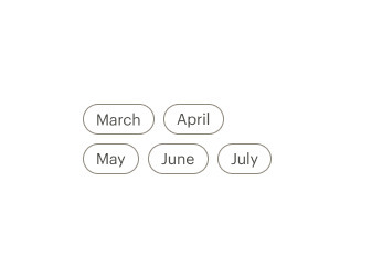
- Use a logical order, whether it’s alphabetical, numerical, or time-based
- Clearly communicate the effect of selecting the option
- Provide a link or include a subtitle for more information. Don’t rely on tooltips to explain a radio button
- For a more prominent alternative to radio buttons, use single select chip groups
- For a more prominent alternative to checkboxes, use multiple select chip groups
Writing guidance
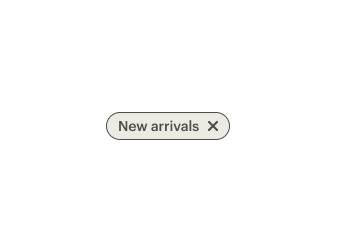
Do use sentence case with only proper nouns capitalized.
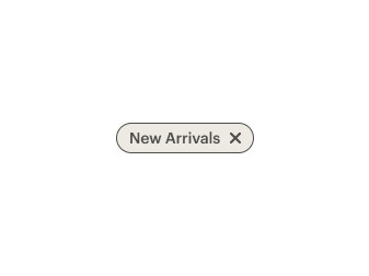
Don't use title caps.
Do make text brief.
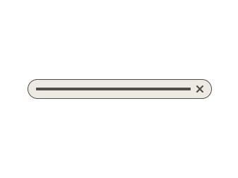
Don't put too much text in the chip.
Do write sentence fragments with no ending punctuation.
Don't add terminal punctuation.
Do use positive phrasing.
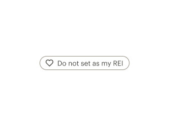
Don't use negative phrasing for labels.
| Criteria | Stateful | Filter | Single selection | Multiple selection |
|---|---|---|---|---|
| Can show confirmation feedback | — | — | — | |
| Automatically deselects all other chips in the group | — | — | — | |
| Includes more than one option per chip group | — | — | — | |
| Selecting one chip shouldn't change the selection status of another chip in the list | — | — | — | |
| Can optionally include an X remove icon | — | — | — |
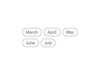
Do allow a group of chips to overflow to a new row.
Don't create excessive line breaks in a group of chips.
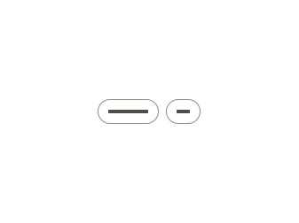
Do allow chip containers to hug their contents.
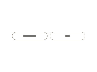
Don't add extra padding to make all chips the same width.
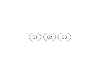
Do display selection chips sequentially.
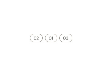
Don't display selection chips in random order.
Do display chips that offer a selection as a group.
Don't display a single chip to offer a selection.
What Cedar provides
- CdrChip uses a button tag
- CdrChipGroup implements keyboard navigation for a group of CdrChips
Development responsibilities
When using this component, here's what you are responsible for:
- For a group of chips related to a single selection, use
role=\"radio\",aria-checked, andtabindexon each chip and wrap the group in a CdrChipGroup component. The selected chip should havearia-checked="true"andtabindex="0"set, while the rest of the chips should havearia-checked="false"andtabindex="-1" - For a chip controlling a selection made elsewhere on the page, set aria-controls on the chip to point to the ID of the input being modified
- For a chip that toggles a selection on and off, use
role="switch"andaria-checkedto designate its state - For other uses of CdrChip please reach out in Slack at #cedar-user-support"
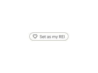
Icon slots
- Place other icons in the icon-left slot
- Use only one icon per chip
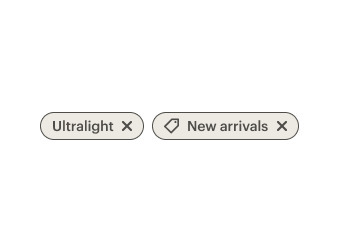
Do use either icons in the right or the left slot per chip and chip group.
Don't put icons in the right and left slots in a single chip or chip group.
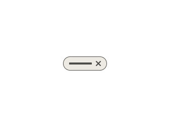
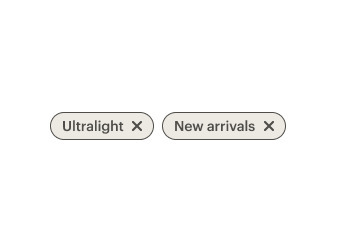
Do use the X remove icon in the right slot.
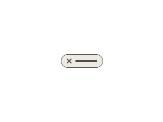
Don't use the X remove icon in the left slot.
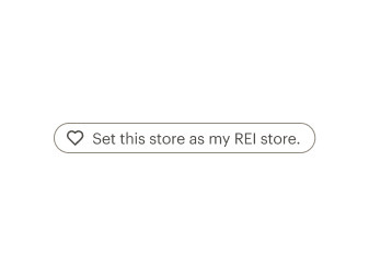
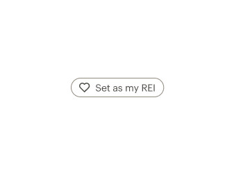
Stateful
- For chips meant to toggle a single selection on and off, use the click event and dynamic properties to change the label or state of a chip
- Use the
aria-pressedattribute to designate the state of the toggle
Filter
- Filter chips representing dynamically-removable user selections should include an X icon in the right icon slot and link to the ID of the input it controls using
aria-controls - The
aria-pressedproperty should be set to true to designate that this selection is active - Filter chips linked to a checkbox should appear selected and be included in the same form group as the checkboxes
Selection
Single select
- For single select chip groups, apply
role='radio'to each chip, usearia-checked="true"andtabindex="0"to designate the selected chip, and applyaria-checked="false"andtabindex="-1"to the other chips - Group the chip elements directly inside a CdrChipGroup element to ensure keyboard navigation is properly managed
- Pass in a label property or slot which describes CdrChipGroup. This label is visually hidden by default
Multiple select
- For multiple select chip groups, apply
role='checkbox'to each chip, usearia-checked="true"to designate the selected chip, and applyaria-checked="false"to the other chips" - Group the chip elements directly inside a CdrChipGroup element to ensure keyboard navigation is properly managed
- Pass in a label property or slot which describes CdrChipGroup. This label is visually hidden by default
CdrChip
Slots
| Name |
|---|
icon-left Icon to the left of the content |
default Primary CdrChip content |
icon-right Icon to the right of the content |
CdrChipGroup
Props
| Name | Type | Default |
|---|---|---|
label Required Sets a label that describes the chip group | string | |
hideLabel Visually hides the chip group label but makes it accessible to screen readers | boolean | true |
Slots
| Name |
|---|
label Override CdrChip label content with a custom element |
default CdrChipGroup content (CdrChip components) |