skeleton
Visually communicates content is in the process of loading
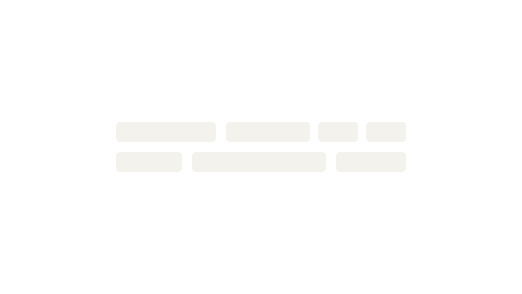
Skeleton components loosely represent a container-based user interface that is not fully loaded when a page initially loads.
Skeletons should:
- Never take the place of static content
- Be temporary and not visible for more than a few seconds before being replaced by content
When to use
- Representing the shape of your UI with generic shapes
- Loading multiple items within a dynamic section of your page
- Representing container-based components like cards, tiles, or tables #dont
- Communicating that an actionable item is busy (like processing a user request)
- Representing isolated dynamic content (like a page title or personalization data)
- Showing loading for in-context operations. Instead, consider using a spinner ::
Using presets
CdrSkeleton is essentially a paint brush you can use to create any UI shape your application requires. Use skeletons to represent regions or sections of a page, such as search results or a product tile filmstrip, rather than specific interactive elements like a standalone button or image.
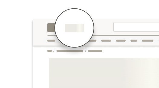
There are several presets (default, heading, line, rectangle, and square) allowing you to quickly assemble basic UI elements. All options are fluid and will expand to fit their container.
When not to use

Do represent the general structure of the container-based user-interface with skeleton.

Don't recreate the exact structure of the container-based user interface with skeleton.
Do use skeleton to represent a yet-to-be-loaded or updating container-based user interface.
Don't use skeleton to represent a yet-to-be-loaded or updating isolated non-repeated user interface.

Do show page titles that never change for a page.
Don't use placeholder content for titles that will change when the page fully loads.
What Cedar provides
- Skeleton wrapper adds
aria-busy=trueandaria-live=”polite” - The motion effect is disabled automatically if a user has indicated they prefer reduced motion
Development responsibilities
When using this component, here's what you are responsible for:
A skeleton should not be visible for more than 5 seconds. A fallback is needed if loading is delayed or fails.
Use a skeleton in conjunction with other Cedar components to construct whatever UI approximation your app requires.
<CdrSkeleton v-if="contentLoading">
  <CdrCard class="skeleton-card">
    <section>
      <CdrSkeletonBone type="rectangle" />
      <div class="inset">
        <CdrSkeletonBone type="heading" />
        <div class="skeleton-card--body">
          <CdrSkeletonBone type="line" />
          <CdrSkeletonBone type="line" />
          <CdrSkeletonBone type="line" />
        </div>
      </div>
    </section>
</CdrSkeleton>
<CdrCard v-else>
  <!-- True UI/Content  -->
</CdrCard>
Motion
Skeletons use motion in a left to right gradient to convey the UI is still loading and the page is not frozen. You can disable this effect.
<CdrSkeleton>
  <CdrSkeletonBone :motion="false" />
</CdrSkeleton>
Suspense
Use CdrSkeleton with Vue's built-in suspense component to render a fallback for asynchronous components.
<Suspense>
  <!-- component with nested async dependencies -->
  <MyAsyncComponent />

  <!-- loading state via #fallback slot -->
  <template #fallback>
    <CdrSkeleton>
      <CdrSkeletonBone />
    </CdrSkeleton>
  </template>
</Suspense>
CdrSkeleton
Props
| Name | Type | Default |
|---|---|---|
motion Toggle animation on/off. Automatically disabled if prefers-reduced-motion is set by user | boolean | true |
Slots
| Name |
|---|
default CdrSkeleton content (CdrSkeletonBone components) |
CdrSkeletonBone
Props
| Name | Type | Default |
|---|---|---|
type Sets the type of content placeholder | union | default |