Status notifications
Status notifications inform users that something on the page has changed. These responses help users understand page processes, actions they have competed, additional options available, or actions still needing attention. Common examples include success and warning messages.
| Transient status notifications | Persistent status notifications | |
|---|---|---|
| Priority | Low, minimally disruptive | Prominent, medium priority |
| Expectancy | Unexpected | Unexpected |
| Blocking | Non-blocking, temporary, usually auto dismisses | Non-blocking |
| Required | Not required | Not required |
| Information | Advisory supplementary information | Advisory supplementary information |
| Location | Overlay, typically in the top right of page | Inline on page, generally located in associated section of effected content |
| Components | Toast | Banner |
Transient status notifications are temporary messages that come and go without user input. They indicate the completion of a task or process initiated by the user or the application itself.
Their purpose is to provide:
- Confirmation when updating and removing items
- Simple messages when saving user preferences
- Contextual information on the page processes
They also allow the following options:
- May be dismissible
- May be clicked on to see what’s previously happened
When to use
- Confirming that a task or process initiated by the user was completed successfully
- Providing contextual information on the page processes #dont
- Exposing a status change to a product caused by user selection (see persistent status notifications)
- Providing error or warnings on the status of items in the user’s cart (see persistent status notifications)
- Providing confirmation when updating and removing items that provides navigation or other actions (see persistent status notifications)
- Notifying users of a potential problem, outside of a form, that may require their attention (see persistent status notifications)
- Changing inline content based on user selection (see update notifications)
- The content added to the page is critical and needs immediate attention (see alerts)
- User interaction is required, or content is critical to the user flow (see modal) ::
- Return user focus to a logical location
- If moving focus to the notification, provide the notification with at least one focusable UI element (i.e. close button, primary button)
- If moving focus to the notification, make the notification content container dismissible
- If moving focus to the notification, on dismiss the notification return focus to the next logical location in the page flow
- Meet the standard color ratio requirements for both text (4.5:1) and activatable components (3.0:1)
- Use for short messages to confirm an action
- If notification is displayed as an overlay, interactive controls should be contained
- Allowing the notification to block page content
- Placing the notification near or on top of navigation area
- Opening the notification as a blocking overlay window
- When triggered, live regions only read out their content to assisted technologies. They will not distinguish text from actionable elements present within a notification
- Users may infer that actionable element is present, however a user will need to guess what element to search for. This is especially problematic for notifications that are automatically dismissed, as users will have limited time to correctly guess and act on this choice
- Return focus to next logical location in the page flow
- Ensure contained action is also readily available on the page
- If the action is not available on page, the action should be added to a notification history page (see ARIA’s log role)
- Expose a status change to a product caused by user selection
- Provide non-validation errors, warnings, or updates on the status of items in the user’s curated item list
- Provide confirmation when updating and removing items which provide navigation or other actions
- May include detailed information
- May include additional actions
- May be dismissible
- Exposing a status change to a product caused by user selection
- Providing confirmation when updating and removing items that provides navigation or other actions
- Increasing visibility of existing errors
- Valid form options cause invalid selections #dont
- Confirming that a task or process initiated by the user was completed successfully (see transient status notifications)
- Changing inline content based on user selection (see update notifications)
- The notification relates to an actionable element in a busy state (see loading notifications)
- Providing errors, warnings, or success messaging related to user inputs (see validation feedback)
- Providing summaries of errors, warnings, or success messaging related to form submission (see validation summaries)
- The content added to the page is critical and needs immediate attention (see alerts)
- User interaction is required, or content is critical to the user flow (see modal) ::
- Add
role=”status”to the markup on activation, announcing the notification without interrupting the page flow of the user - Add
IDto be referenced viaaria-controlson the element which is causing the notification - Ensure the notification container can receive focus
- Ensure the notification content is dismissible if moving focus to the notification
- Ensure an element with role status does not receive focus because of change in status
- Make the relationship between page controls and the notification explicit with the
aria-controlsattribute if another part of the page controls what appears in the status - Opening as a blocking overlay window
- Moving focus automatically to the notification
- Directing the user to a new page or window
- Overusing notifications as they may interrupt the user experience
- Reusing bespoke UI intended for other message or navigation types
- Persistent status notifications may:
- Display notifications in unique UI to create distinction around themselves and the page content
- Open or update content in locations unrelated to the action which caused the notification to appear
- Update a live region of the page
- Use the HTML
<aside>tag, denoting the section that, though related to the main element, doesn't belong to the main flow - Ensure the notification will not be removed if keyboard focus or mouse hover is within or over the notification
- Return user focus to a logical location
- Provide at least one focusable UI element (i.e. close button, primary button)
- Creating notifications that disappear automatically.
- Clearly communicate what is happening to the user.
Transient status anatomy
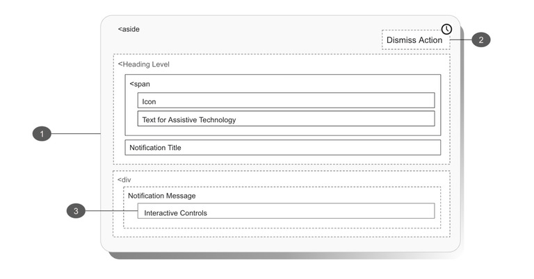
1. Status notifications as an overlay
Best practices
What to avoid
Options:
Transient status notifications may appear as a timed display.
2. Automatic dismissal
Status notifications may be displayed for a set amount of time rather than become a lasting feature of a page. In these cases, if a user ignores a timed notification, it will still mean the action is completed successfully.
For example, an item would still be added to a cart regardless of a user's engagement with the notification informing them of the successfully added item.
3. Interactive controls
Interactive controls within notifications produce several hurdles for users of assistive technology. Specifically, the Aria-live region will not preserve the semantics of elements being read aloud. As an example, consider a virtual outfitting notification previously seen on the product page. A user will not know what the title, copy, or link are in the following text:
"Need help deciding? Schedule a free 1-on-1 virtual appointment with one of our experts. Book now."
Users may infer the "book now" text is a link—or just as likely search for a button or guess the entire text would be active.
Consider the following:
If the notification must include an actionable element, you are responsible for the following:
Persistent status notifications are “in page messages” informing the user that something on the page has changed. This feedback is a response to user actions, like making a product selection or settings change.
Their purpose is to:
They also allow the following options:
When to use
Persistent status anatomy
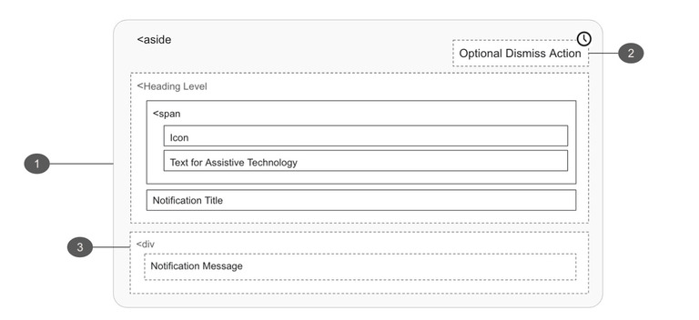
1. Container
Best practices
What to avoid
Options:
2. Optional dismiss action
Best practices
What to avoid
3. Message
Best practices
For further reading on status notification accessibility, check out these references: