Error handling
Designing forms to prevent errorsForms should be easy to use and designed to prevent errors. Errors happen when the data a user enters into a form doesn't match our system requirements.
Form validation checks user inputs for errors, allowing us to provide feedback and instructions in context to what the user is doing. Validation feedback can be presented before, during or after an interaction, depending on the need and technique used.
Because validation is a blocking technique, use it only when other methods have failed. Non-blocking techniques include providing help text, accepting multiple formats for input data, and using input masking.
For logical and easy to use forms, design to prevent errors.
Labels:
- Associate form labels with controls
- Label must have a relationship to the input
- Clearly label required fields
- Label text must adequately inform the user of input type expectations
- Position the required label next to the input field label
Instructions and helper text:
- Avoid using the placeholder attribute, instead, use the help text slots to provide formatting information
- Use helper text slots to state content requirements
- Use helper text to clearly and concisely inform the user of formatting requirements
- Provide instruction or hints once a user has interacted and moved on from the form field
- Do not provide instruction to a form field which has not received user input, for example to one clicked into and out of
- Provide instruction that changes progressively to guide the user through the error process
- Ensure the instruction is visible to all users:
- Avoid moving the form fields up or down when displaying validation
- Place helpful formatting instruction above the input if that formatting instruction will remain helpful to your users during error resolution
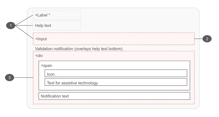
- Display notifications directly below the field in error (note that this will overlay the bottom help text slot on cdr-inputs)
- For a group of elements such a form group of checkboxes, display notifications below the fieldset container
Formatting and validation:
- Accept and filter multiple formats for data
- Integrate input masking that can clearly visualize formatting expectations
- Only use live validation on form fields with the strictest input requirements
- Don’t place formatting help or expectations in the placeholder of an input
- Limit the amount or need of validation—use other options first
- Direct the user’s attention to issues in the form after using the submit button (forms will not submit to the server until issues are resolved)
- Don't remove incorrect data entered by the user
- Don't provide validation messages for unfilled inputs until the user attempts to submit the form
Design:
- Only require form fields that are absolutely needed
- Ensure forms are keyboard accessible
- Outside of page and site controls, form elements should be contained within a form
- Groups of controls should use the cdr-form-group component or be within a fieldset, and be provided a legend description
- Use meaningful colors and iconography
Content:
- Request less information in your form. Combine fields such as first and last name where possible and solicit only the most relevant and important information from your users
- Display messages within the context of the action
- Use clear and simple language, not technical language
- Don't shame the user for the error
- Don't joke with the user about the error
- Don't use cute language
- Use language that conveys REI's brand
- Avoid uppercase text as it gives the visual impact of shouting
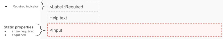
1. Error prevention
The best interaction a user can have with a form is to easily enter their data and to move on, never interacting with the provided validation. We can help our users avoid blocking validation by:
- Clearly identifying required form fields,
- Using clear and informative text for labels
- Providing persistent formatting instructions.
 |
|---|
| Form error prevention anatomy |
Best practices
- Clearly label required form fields
- Apply the
requiredand/oraria-requiredattributes to "required" form fields - Provide text conveying the field is required for assistive technology
- Provide an explanation to the user when the "submit" button is not available
- Provide a clear and informative form title
- Create a clean and easy to understand layout by placing groups of form fields into fieldsets and providing adequate spacing between all elements
- Accept and filter multiple formats for form field data Use helper text to clearly and concisely inform the user of any formatting requirements
- Integrate input masking to clearly visualize formatting expectations
- Only require fields that are absolutely needed
- Use an asterisk to indicate a field is required
- Append "(Optional)" text to non-required fields within a form where the bulk of elements are required
- Consider placing formatting instruction above the input if that formatting instruction will remain helpful to your users during error resolution
What to avoid
- Using color alone to convey required or non-required fields
- Altering the user provided input to make it validate
- Placing formatting help or expectations in the placeholder of an input
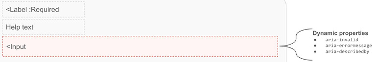
2. Error detection
Once the user has created an error and validation has been triggered, it's necessary to call out the form field(s) in error and provide instruction on how to resolve them.
 |
|---|
| Form error detection anatomy |
Best practices
- Identify each field in error
- Provide suggestions to correct the errors
- Append
aria-invalid="true"to the input - Map the associated id of the notification instruction to the input via
aria-describedby(widely supported) oraria-errormessage(not yet widely supported) - Append
aria-live role="status", orrole="alert"to the notification container - Ensure the notification content is hidden or remove the
aria-errormessageattribute or its value - Preserve as much user-entered input as possible
- Add information about the error in the page
<title>if the submission causes a page reload or a new page load - Consider disabling the form submission to help direct the user's attention to issues that exist
Options
The form validation error detection may:
- Also use
aria-describedbyin conjunction witharia-errormessage - Be scripted to show on the screen for sighted users, but attempts to announce the real-time messages to screen reader users can be problematic. It is usually acceptable to wait to announce real-time errors until after form submission, assuming that no data has been saved yet
Error detection location
A user's ability to complete a form may be impacted if the validation notification is not displayed in a manner they expect.
When providing inline instruction, it’s important to make it non-disruptive. This helps users complete a form more quickly. We can help reduce a user's cognitive lift by adding any additional information to locations within their natural reading flow, either to the right of the form element or below it. Displaying all validation in a validation summary at the top of a page or top/bottom of a form will produce a poorer user experience than providing messaging inline as the user interacts with each form element.
There are three unique opportunities which we can target to provide notification updates:
- While user is typing: using the
OnInputevent - Once the user moves focus: using the
OnChangeevent - Once the user submits: using the
OnSubmitevent
Validation while typing
"On input" validation provides instant, real-time feedback as the user types making it highly visible. However, it forces them out of a completion mindset and may cause frustration.
While useful for form fields with very strict input requirements, research has proven real-time validation causes more user errors and takes longer to successfully complete the form.
Instruction offered this way should focus on positive progressive cues and should not present error instruction. It should not be used to immediately communicate that the user has caused an error.
Use instant validation:
- For difficult-to-answer questions where a user may create several formatting errors
- To indicate progress as a user types
Don't annoy the user by:
- Providing instant error instruction
- Using real-time feedback on simple inputs
Validation upon moving focus
"On change" validation takes place after the user changes or removes focus from their current element. In most cases this is the best time to begin validating user data as the user will not need to locate or navigate back to the form field that contains the error. This informs the user about additional expectations but does not block them from moving on and working through the remainder of the form.
Providing validation instruction on change (and enhancing the validation on submit) can ease the users through the form without blocking or frustrating them. For example, we could alter the appearance of an element on change, which would warn or confirm the user's input. If needed we could reinforce this change on submit with additional validation instruction.
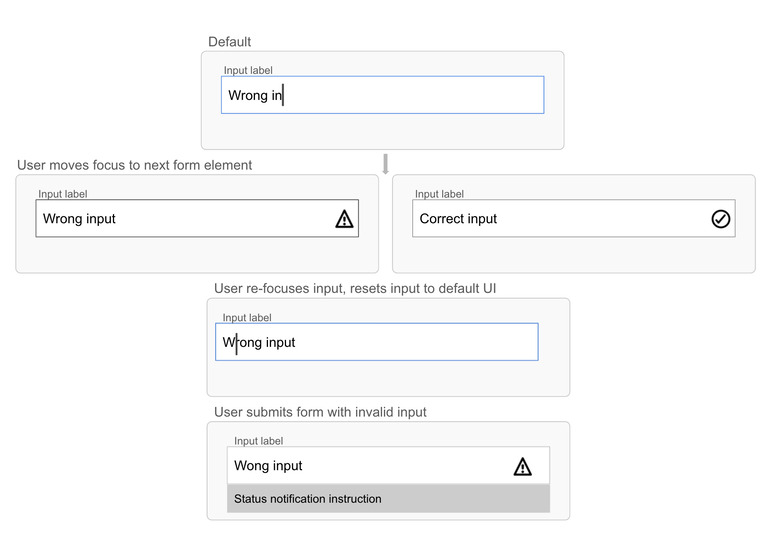
Validation upon submit
A user submitting a form expects to move on or be reminded of existing errors. They may be on a location of the page where they are unable to see individual invalidated form fields. For longer forms, it may be beneficial to provide a validation summary to reiterate errors and guide users to the locations needing work.
“On submit” offers validation in a location the user expects. While less optimal than "on change," this event is preferable to "on input." Even when users are aware of errors, if they are in a completion mindset they may knowingly move through a form and wait to submit before addressing extra form needs.
Consider pairing "on change" progressively with "on submit" validation. A user who receives errors after submitting the form may no longer be able to see the input errors due to page scroll or some other limiting factor. In this case they may find a validation summary useful or needed.
Validation as a return from the server
Client side or "inline" validation notifications can interact with the user as they are working through the form process. Inline validation allows us to interact with a user prior to the data’s submission to a server.
Use inline validation where possible to enhance the user experience. This validation does not replace server validation, rather it enhances it with the ability to present instruction prior to submitting or refreshing the page.
When the user submits the form, their information is sent to the server and validated. If validation did not take place prior to server validation or if there are additional errors, the response of the “validator” is sent back to the user’s computer
Best practices
- Return the form (with the user's data still in the fields)
- Provide a validation summary at the top of the page
Options
Server-side validation notifications may:
- Change the title of the page
- Give the error a heading level: provide a header, preferably a H1, so that assistive technology users can jump directly to the error and correct it
- Provide a same-page link so that users can jump directly to the form field that has the error
3. Validation notifications
Validation notifications provide feedback or instruction on how to resolve detected errors. They are also used to confirm task completion. For more specific guidance on the different types of validation notifications, see our article on validation feedback.
Use aria-live to indicate that an element will be updated. It describes the types of updates the user agents, assistive technologies, and user can expect from the live region.
Use aria-atomic to indicate whether assistive technologies will present all, or only parts of the changed region based on the change notifications defined by the aria-relevant attribute.