select
Allows the selection of one or more options from a dropdown list
CdrIconSelect components are used for gathering user data, allowing a choice from a list of options.
Select and dropdown components tend to look similar, but have different functionality. Unlike select, dropdowns contain links and take users elsewhere. Also, the browser owns the select appearance, while you can style dropdowns.
When to use
- Choosing an option from a predefined set of values
- Recommending a default option for most users #dont
- Viewing or comparing all options is needed. Instead, use radio buttons
- Displaying a limited number of options. Instead, use radio buttons
- Displaying a "yes" or "no" selection. Instead, use radio buttons
- Turning an option on or off. Instead, use checkboxes
- Setting a value is required. Instead, use radio buttons
- Displaying more than 10 options. Instead, use inputs
- Sending the user to other areas of the site. Instead, use links ::
When not to use
Make sure select components are:
- Identifiable: Select fields indicate that users can change its value
- Findable: Select fields are easy to find among other elements
- Legible: Select fields indicate their state such as enabled, focused or disabled
Options
- Define width using CSS styles
- Height options are medium and large. These variations can be used for creating media queries for responsive layouts, or to call more or less attention to the component
Labels
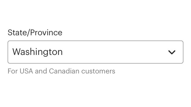
Do use concise and meaningful labels.
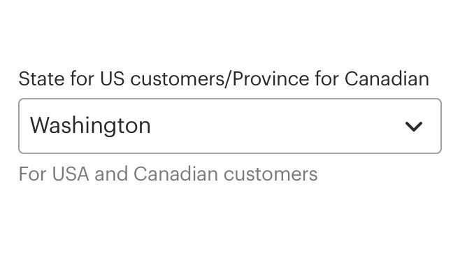
Don't use instructional or help text for the label.
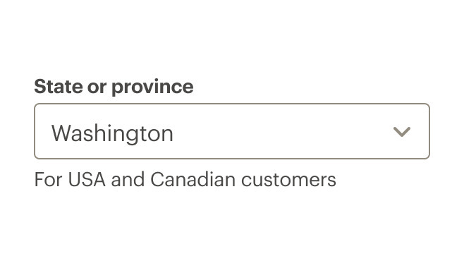
Do use sentence case for labels.
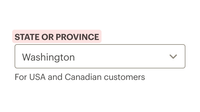
Don't use all caps for labels.
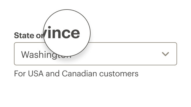
Do remove all terminal punctuation.
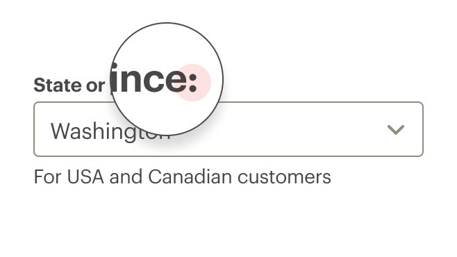
Don't use colons after labels.
Prompt text
- Limit prompt text to 1–3 words
- Use descriptive prompt text for accessibility users who use screen readers to fill out forms
Menu or list text
- Use sentence case
- Simplify the list. If an option is rarely selected, consider removing it from the list
Use common sort order for menu items. Options include:
- Frequency of use (recommended): For example, commonly used credit cards would be listed first
- Alpha: For example, state or city locations
- Numeric: For example, distances or sizes
Helper text
- Use helper text for hints or suggestions
- Be concise. Too much helper text can make a form look and feel difficult to use
With icons
Use icons to trigger a popover or tooltip for hints or suggestions.
Link text
- Use a link in the
infoslot when moving or navigating to another page or to a different portion of the same page - Use if navigating user to long or complex information
- Avoid changing options in a dropdown menu based on the input from a different select field
- Use a prompt in the format of “Select a…” or “Select category…”
Required fields
An asterisk will appear next to the input label if the status is required. The input field will have aria-required set.
Validation
Validate the user’s data before form submission. Use the error property and slot to render a message on error.
What Cedar provides
- Requires a value for the
labelfield - When hiding a label, the
aria-labelattribute is set to thelabelvalue - Links
helper-textcontent to the input field using thearia-describedbyattribute
Development responsibilities
When using this component, here's what you are responsible for:
- Always provide a label for each select control
- Use the
hide-labelproperty to visually hide the label text while still leaving it available to screen readers
When using the aria-describedby:
aria-describedbyattribute does not override the select label- Use this attribute in addition to a label
- Use this to reference descriptions appearing as tooltips
- Content passed into the
helper-textslot is automatically linked to thearia-describedbyattribute
For projects that cannot make use of the Vue.js component, the CdrSelect styles are available through the @rei/cdr-component-variables package as SCSS mixins. These can be applied to plain HTML elements. See examples on the component variables page.
Multiple select
Pass the native HTML select multiple attribute to render CdrSelect as a multi-select. Use the multipleSize prop to control the height of the multi-select.
default multi-select:
<br />
<cdr-select
  v-model="defaultModel"
  :background="backgroundColor"
  label="Select label"
  :options="defaultOptions"
  multiple
/>
<br />
With multipleSize:
<br />
<cdr-select
  v-model="defaultModel"
  :background="backgroundColor"
  label="Select label"
  :options="defaultOptions"
  multiple
  multipleSize="6"
/>
Nested options
Render CdrSelect with nested options using the optgroup tag.
<cdr-select
  v-model="defaultModel"
  :background="backgroundColor"
  label="Select label"
>
  <optgroup label="Size">
    <option value="12">12 oz</option>
    <option value="16">16 oz</option>
    <option value="20">20 oz</option>
  </optgroup>
  <optgroup label="Color">
    <option value="orange">Orange</option>
    <option value="blue">Blue</option>
    <option value="green">Green</option>
  </optgroup>
</cdr-select>
When using CdrSelect in a TypeScript application, we recommend importing the selectOption interface from the library if you want fine-grained control over the options passed to the component.
CdrSelect can optionally take an array of objects for its option list, so using this interface will prevent you from needing to define your own. Using a helper extension In VS Code, like Volar, will give you helpful hints when importing this interface as well.
ParentComponent.vue
<script setup lang="ts">
import { CdrSelect, type selectOption } from '@rei/cedar';

defineProps({
  opts: { type: Array<selectOption>, default: () => [] },
});
</script>

<template>
  <main>
    <CdrSelect
      :options="opts"
      ...
    />
  </main>
</template>
CdrSelect
Props
| Name | Type | Default |
|---|---|---|
id Custom ID that is mapped to the label ‘for’ attribute. If this value is not set, it will be auto-generated. | string | |
label Required Sets the text value for the select label. Required for accessibility compliance. Use ‘hideLabel’ to visually hide the label but keep it available to screenreaders. | string | |
hideLabel Visually hides the label element, but leaves it available to screen readers for accessibility compliance. | boolean | false |
prompt Adds an option that is disabled and selected by default to serve as a `placeholder` for the select. | string | |
options Build options programmatically with data. Provide an array of objects [{ text: String, value: String}] for greater control or provide an array of strings ['String'] for simpler setup (value and text will be the same). | SelectOption[] | string[] | |
background Sets the background color the radio button is rendered on Possible values: primary, secondary | backgroundProps | |
size Sets the component's size; values can target responsive breakpoints. Example `large@lg` Possible values: large | string | |
error Sets the select to an error state, displays the `error` slot if one is present. | boolean|string | false |
errorRole Sets the `role` attribute for the embedded error state messaging. | string | status |
modelValue
| string|number|boolean|object|array|symbol|func | |
disabled Disables the input and sets appropriate styling | boolean | |
required Sets aria-required on the input field and displays an asterisk next to the select label | boolean | |
optional Displays '(optional)' text next to the select label. | boolean | |
multiple Turns CdrSelect into a multi-select element. | boolean | |
multipleSize Sets the height of the CdrSelect when using the multiple option. This number corresponds to the number of select options that will be visible without scrolling. | number |
Slots
| Name |
|---|
helper-text Helper text above the select field |
info Link or icon to the right above the select field. |
pre-icon Icon preceding text within the select field |
default CdrSelect content (<option> tags). Leave empty if using the `options` prop. |
info-action Action-wrapped icon to the right of the select field |
error Error messaging text that is displayed when the `error` prop is true. |
Events
| Name | Parameters |
|---|---|
update:modelValue Event emitted by v-model on the radio's <input> element | modelValue |