pagination
Allows people to navigate to the next or previous page within an experience
CdrSelect,CdrIcon| Type | Purpose |
|---|---|
| Breakpoints: sm, md, and lg | Displays as a list of number text links. Prev and Next links are also added when applicable. |
| Breakpoints: xs | Adapts to the select component using the native UI dropdown menu. |
When to use
- Providing navigation to break apart large quantities of content
- Breaking up search result pages into manageable sections #dont
- Using lazy load or infinite scroll within an experience
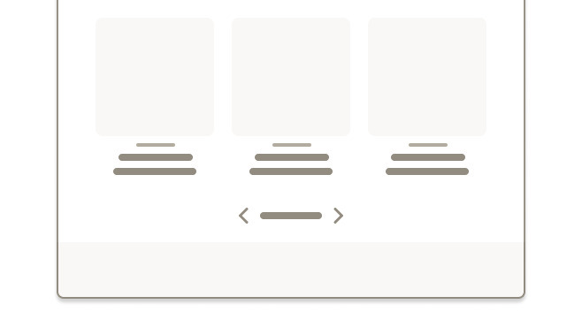
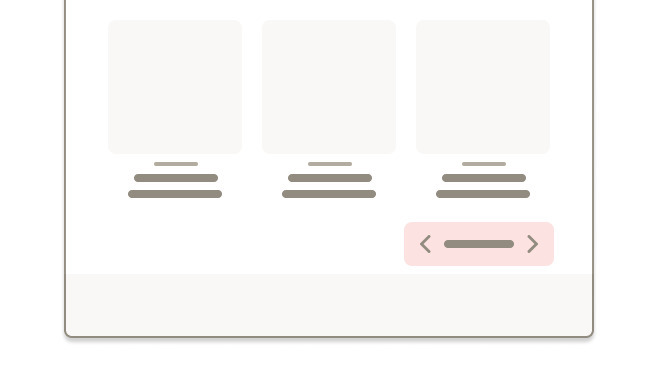
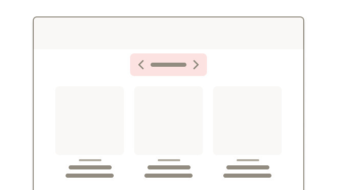
- Switching between slides or content in a carousel
- Displaying editorial content. Instead, show entire article on one page ::
When not to use
SEO
For best SEO support, pagination requires additional markup and logic in the <head> of the page:
- Pagination tags should be implemented in the
<head>section of the page source - Each page in a series should have a self-referencing canonical tag
- Only a
rel=”next”attribute should be implemented on the 1st page of a series - Only a
rel=”prev”attribute should be implemented on the last page of a series Rel=”next”andrel=”prev”tags on each page except for the 1st and last page of a series- Each link that is linked to should be linked with an absolute URL
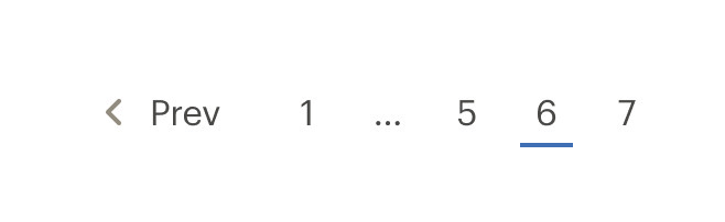
- Page number links are truncated as follows: (first) ... (current -1) (current) (current +1) ... (last)
- If there are 7 pages or fewer, all page number links will be shown
- Prev or Next text links are removed when the first or last page are active
Within pagination, link styles are adapted:
- Text links are displayed as the primary text color
- Prev and Next links use the small size for the caret-left and caret-right icons
By default, pagination is center aligned under category or search results content.
Do center align pagination beneath search results.
Don't right or left align pagination.
The primary placement for pagination is at the bottom of a page that displays rows of content.

Do place pagination at the bottom of search results.
Don't place pagination above search results.
Use pagination logic to truncate the link list, when possible.
Do show the first, previous, next, and last page links when possible. If not, use the degraded designs.
Don't show all available pages.
Pagination adapts to a select component with a native UI dropdown menu on XS breakpoints. This provides a mobile-friendly experience.
What Cedar provides
- Wraps the pagination links in a
<nav>element to let screen readers recognize the pagination controls - Sets
aria-label="pagination"to describe the type of navigation - Indicates the active page by adding
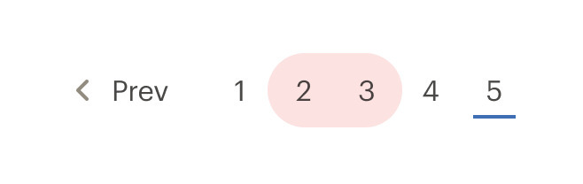
aria-current="page"to the link that points to the current page
Development responsibilities
When using this component, here's what you are responsible for:
If you are building an intra-page button-based pagination, use the forLabel property to indicate what content is being paginated. For example:
<div>
  <div>{{ reviews content }}</div>

  <cdr-pagination
    link-tag="button"
    for-label="pagination for reviews"
    :pages="pages"
    :total-pages="5"
    v-model="page"
  />
</div>
Intra-page navigation
By default, CdrPagination assumes that you are navigating through pages on a site and will update the URL on change.
For content requiring pagination but is part of a larger page, use the linkTag and forLabel properties to render a button-based pagination. Set linkTag to "button" and set the forLabel to describe what element you are paginating, for example "Pagination for user reviews."
Overriding default navigation
By default, pagination uses anchor elements which navigate the users web browser when clicked.
Override this behavior by adding a handler to the navigate event which emits (currentPage, currentUrl, event) and calling event.preventDefault() in the handler function. The currentPage and currentUrl can then be used to implement router based navigation or programmatically navigate the page. Use this also in conjunction with the link-tag property to render a button-based pagination.
When using CdrPagination in a TypeScript application, we recommend importing the paginationItem interface from the library so you can correctly define the component props.
CdrPagination expects an array of objects with a specific schema, so using this interface will prevent you from needing to define your own. Using a helper extension In VS Code, like Volar, will give you helpful hints when importing this interface as well.
ParentComponent.vue
<script setup lang="ts">
import { CdrPagination, type paginationItem } from '@rei/cedar';

// CdrPagination expects an array of paginationItems passed to the pages property
defineProps({
  pages: { type: Array<paginationItem>, default: () => [] },
});
</script>

<template>
  <main>
    <CdrPagination :pages="pages" />
  </main>
</template>
CdrPagination
Props
| Name | Type | Default |
|---|---|---|
id Define a custom slug for the generated pagination item IDs | string | |
totalPages Sets the total number of pages for displaying "Page x of <totalPages>" | union | null |
pages Required Array of objects containing pagination data | Array | |
linkTag Sets which tag type is used to render pagination elements | LinkTag | a |
forLabel Used to customize the aria-label for the root pagination element | string | |
modelValue Used for binding v-model, represents the current page | number |
Events
| Name | Parameters |
|---|---|
update:modelValue Event emitted by v-model on the select <input> element to indicate current page. Only used on small devices | modelValue |
navigate $emit event fired when page changes based on user interaction by clicking a link or selecting an option from the select on mobile. `event.preventDefault()` can be used to override the default link navigation behavior. | - |