Typography
Our two typefaces: Stuart for warm character; Graphik for clean simplicityCedar supports two primary brand typefaces: Stuart and Graphik. Each play a specific role in our typographic system. While Graphik is available to consumers outside the co-op, Stuart is licensed and proprietary to REI.
Stuart
Designed exclusively for the co-op, Stuart was influenced by the U.S. National Park Service signage. Modeled after Plantin, Stuart embraces the same softness in both structure and finish and its warm character balances well with the clean simplicity of Graphik.

Graphik
Graphik is a sans-serif typeface designed by Christian Schwartz and released through Commercial Type in 2009. Inspired by the lesser-known grotesques and geometric sans-serifs, Graphik’s lower stroke contrast and a generous x-height lend it great versatility. Graphik is used for high-function or less-expressive moments.
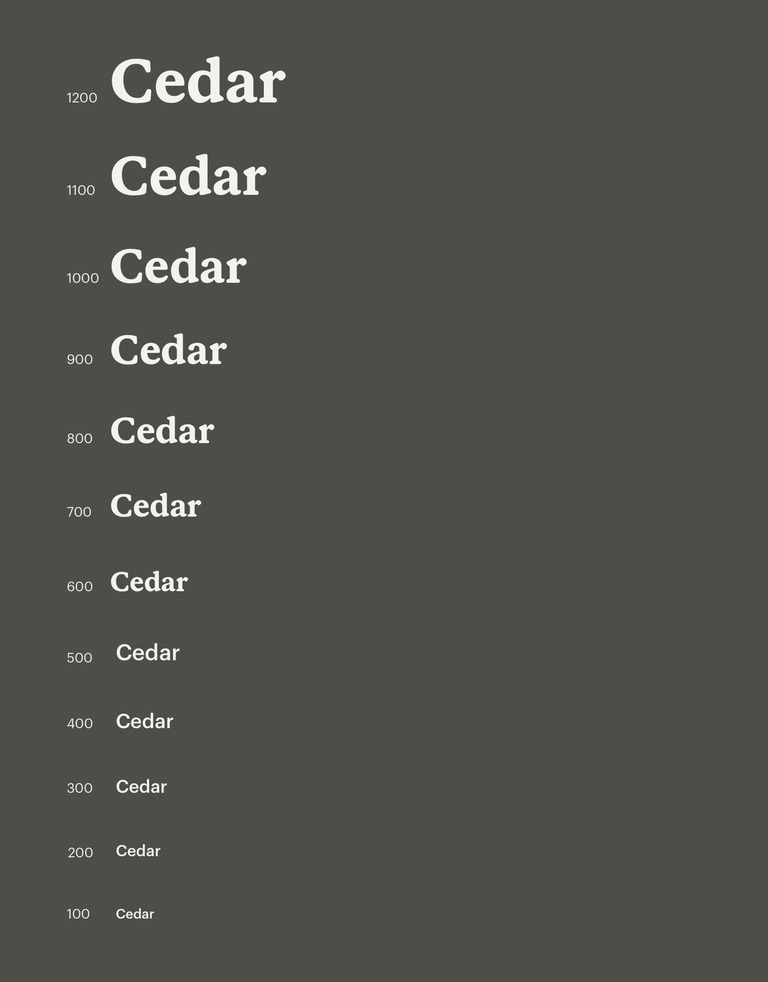
The typographic scale manages the font sizes used within Cedar. All type styles are derived from this scale.
Cedar typography references two distinct font stacks: a serif and a sans-serif. Our default display preference always prioritizes Stuart and Graphik. Local fonts act as fallbacks should a brand font fail to load.
Serif
Font-family: Stuart, Georgia, serif
Sans-serif
Font-family: Graphik, 'Helvetica Neue', sans-serif
Supported languages
Both Stuart and Graphik support the standard Western European languages: Italian, Spanish, Portuguese, French, German, Dutch, English, Danish, Swedish, Norwegian and Icelandic.
If everything goes right, REI Stuart will load. If it doesn’t, Apple and Microsoft platforms will display Georgia as the serif font. Android devices will display Noto Serif and Linux devices will display Liberation Serif.
For sans-serif fonts, Graphik will display if there are no hiccups. If it fails to load, Apple devices will display Helvetica Neue while Microsoft platforms will display Arial. Android devices will display Roboto and Linux devices will display Liberation Sans.
Size
Font size selection directly impacts both readability and comprehension. Type styles are pre-optimized, which means letter spacing, line height, and paragraph spacing are already integrated into token options.

Type pairing
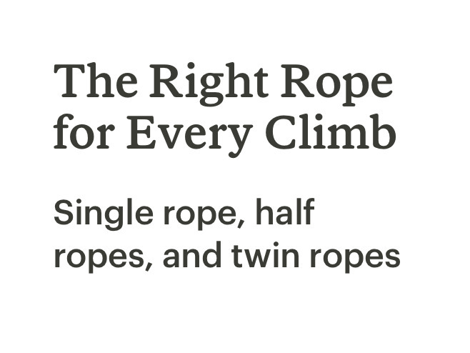
To create the appropriate contrast and hierarchy, use a mix of Stuart and Graphik—the latter typically plays a supporting role.
Italics
Users with certain disabilities like dyslexia might have difficulty making out italicized words. Only use italics if necessary and never for critical user flows.
Do use italics if necessary.
Don't use italics if the copy is part of important user flows.
Font weight
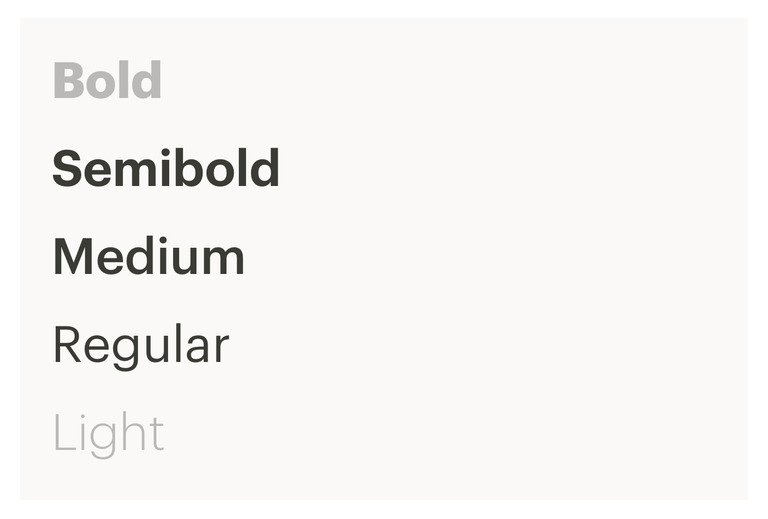
From refined to playful, Stuart’s personality becomes increasingly casual as it gets heavier. While six weights are included in the Stuart family, medium is preferred for most situations.
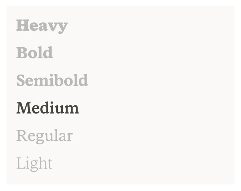
The Graphik family includes five weights. Preferred choices are: regular, medium, and semibold. Regular is appropriate for most applications.
Letter spacing
Stuart and Graphik were both designed with looser tracking to improve readability at smaller sizes. In code-driven environments, tracking is known as letter spacing. To best support the widest range of sizes, the letter spacing of text styles are pre-optimized.

Alignment
For optimal legibility, it’s important to establish a strong vertical alignment. All text should be left-aligned whenever possible. Some exceptions include single words and short headlines. Never left and right justify text.
Do left align text.

Don't center align long headlines.

Do left align text to other elements on the page.

Don't center align short headlines.
Line length
An optimal length, or measure, of a line of copy is 50 to 60 characters. Line lengths more than 80 characters are discouraged.

Do reduce font sizes for mobile so they are the optimal line length.
Don't use the same font size across all device sizes. This will create incorrect line lengths on certain devices.
Do use line lengths of 50–60 characters.
Don't create line lengths of 80 characters or more.