Vertically-stacked list that allows users to expand and collapse additional content
CdrAbstract - Content building blocks with pre-defined, fluid styles
Content building blocks with pre-defined, fluid styles.
Abstract provides a fluid, responsive text style that adapts based on container width.
CdrBanner - Provides contextual feedback messages for typical user actions
Displays informational, warning, success, error, or default messages with optional
icons and action elements. Supports primary messages with expandable message bodies.
CdrBreadcrumb - Navigation used to reveal a page's location within the site hierarchy
Provides a hierarchical navigation trail to help users understand their current location
and navigate back to parent pages. Supports automatic truncation for long breadcrumb trails.
CdrButton - Initiates an action, such as completing a task or submitting information
Buttons allow users to trigger actions and navigate. Use buttons for important
actions like submitting forms or confirming choices. Buttons can contain text,
icons, or both.
CdrCaption - Provides context and credit for an asset such as an image, video, or chart
Captions provide descriptive information and attribution for media content.
Use captions to give credit to photographers, provide context for images,
or describe chart data.
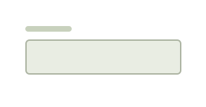
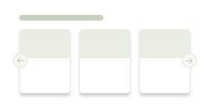
CdrCard - Related, interactive containers linking to a single subject or destination
Cards are flexible containers for grouping related content and actions.
They serve as an entry point to more detailed information and can contain
various types of content including images, text, links, and buttons.
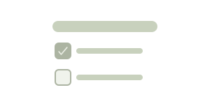
Allows selecting one or more items from a list
CdrChip - Allows people to make selections, filter content, or trigger actions
Chips represent discrete pieces of information or actions. Use chips for tags,
filters, or selections that users can interact with. Chips can contain text,
icons, or both, and can be dismissible.
CdrContainer - Provides base margins and responsive layout logic for pages
Containers define the maximum width of page content and provide consistent
horizontal spacing. Use containers to create well-structured, responsive
layouts that adapt to different screen sizes.
Responsive, accessible filmstrip for displaying a horizontal list of content frames.
CdrFormGroup - Groups related input elements together
Form groups organize related form controls and provide a shared label.
Use form groups to collect related information and show validation errors
that apply to the entire group.
CdrFulfillmentTile - Selection variant of CdrSurfaceSelection with additional interactive states
Fulfillment tiles present delivery and pickup options in a selectable format.
Use these tiles to display shipping methods, store pickup availability,
or other fulfillment choices with relevant details and pricing.
CdrGrid - Simple wrapper for working with CSS grid
Grid provides a flexible layout system based on CSS Grid.
Use grid to create complex, responsive layouts with precise control
over spacing and alignment.
CdrIcon - Communicates meaning through graphics representing simple and complex ideas
Icons are visual symbols that represent actions, objects, or concepts.
Use icons to enhance usability and provide visual cues. Always ensure icons
have appropriate accessible labels when used without accompanying text.
CdrImg - Media for capturing attention and communicating messages
Images enhance content and convey information visually.
Use images to support your message, showcase products, or illustrate concepts.
Always provide meaningful alt text for accessibility.
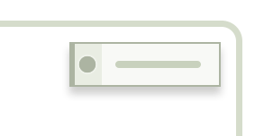
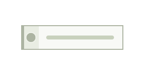
Allows for data entry, editing, and search
Displays a full-width image and heading at the top of a page.
Combines a hero image with heading and subheading text using CdrSplitSurface layout.
Foundational container for creating structured layouts.
Provides a CSS Grid-based layout system with responsive columns, rows, and gap controls.
Clickable text elements used for navigating to other pages or sections
Groups related content items together either vertically or horizontally
Component that pairs images or videos with related text in a consistent way
Disruptive, action-blocking overlays used to display important information
Component for positioning content in 9 different positions relative to a container
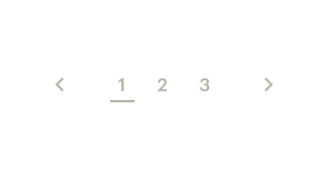
Allows people to navigate to the next or previous page within an experience
Provides instructions for browsers to use alternative image versions in various scenarios
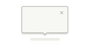
Small overlay used to display contextual information
Short excerpt used to emphasize content or break up a large body of text
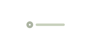
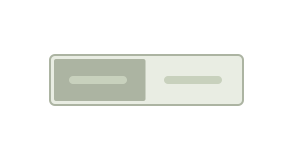
Permits the selection of only one option from a list of two or more
Provides insight into user opinions for products, experiences, and more
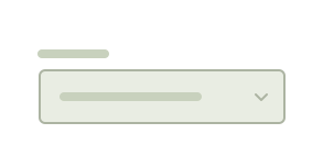
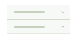
Allows the selection of one or more options from a dropdown list
Visually communicates content is in the process of loading
Introduces a layered surface for distinct content sections, smoothing the transition from one page section to another
Foundational container for creating structured layouts
Permits selection from two opposing options
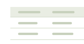
Organizes structured data for users to easily scan, compare, and analyze
Organizes related content into groups for people to navigate between
Text container used for any text element such as paragraphs, headings, and lists
Non-modal dialog used to communicate the status of a task or process
Permits switching two or more options on and off
Floating label used to clarify interface actions


