Heading
Identify and create a hierarchical structure within a pageA heading helps users to identify and create a hierarchical structure within a page. Headings are typically the largest text on the screen. They should be short and include important information. Cedar headings include display, serif and sans-serif options.
| Type | Purpose |
|---|---|
| Display | Display headings, set in REI Stuart, include the largest type styles available. Use them for emotional and impactful messages on top of the funnel experiences (i.e., homepage, brand pages, or landing pages). Because display styles are lighter in weight than other heading styles, they are meant for sizes 800 and above. However, it is recommended to reserve sizes 800 and 900 for mobile breakpoints. |
| Serif | Serif headings, set in REI Stuart, work best in large sizes (cdr-text-heading-serif-600 and above). Use them for functional messages on the middle to bottom of funnel experiences (i.e., product detail pages or checkout experiences). They’re also available for areas where space is limited but an important distinction or callout needs to be made, such as a card title or aligning to marketing collateral. |
| Serif strong | Use serif strong headings very minimally throughout the page. They are generally reserved for important page titles, in cases where type overlays an image, or in situations where additional emphasis is needed. Serif strong headings, set in REI Stuart with a greater font weight than display or serif, work best in larger sizes (cdr-text-heading-serif-strong-600 and above). Like serif headings, these styles are intended to be used for functional messages on middle to bottom of funnel experiences. |
| Sans | Sans headings, set in Graphik, should play a supporting role to serif headings. Sans headings work best in smaller sizes (cdr-text-heading-serif-strong-600 and below). Sans headings are not recommended for page titles or other prominent placements. Instead, use serif or serif strong headings. |
When to use
- Creating a hierarchical structure of information on a page #dont
- Tagging as a semantic heading when an element only needs to be highlighted or emphasized within your content. Instead, use the type scale to alter the size or prominence of the text
- Showcasing long form content. Instead, use body styles ::
- When using this component with semantic headings from
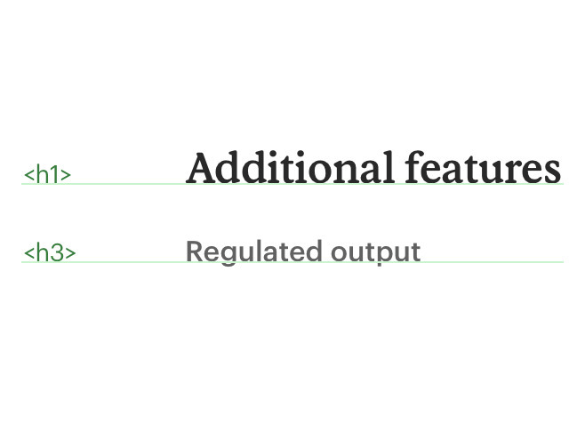
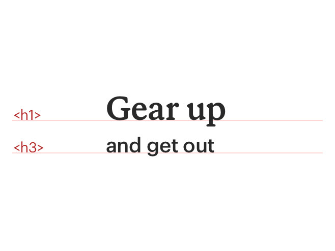
<h1>to<h6>, typographic styles set up a visual hierarchy created within CSS to help establish the order of importance - Identify headings at the beginning of a section
- Position headings at, or near, the top of a section
- Ensure an accessible contrast between text and the background
- Implement image text with proper HTML markup and use CSS to embed any special fonts
- Consider using heading-serif-strong styles
- Be specific. Provide facts or information that stir interest. Avoid broad and generic headings
- Start heading titles with strong and familiar keywords to increase scannability
- Ensure the heading works out of page context, such as search results, social media streams, blog posts, and news feeds
- Start with most descriptive word. For example, instead of “Preparation for floods”, use “Flood preparation”
- Avoid duplicative words in headings (e.g. "More Details")
- Omit needless words. Be clear and concise
- Limit heading length for improved scale across variable container widths
- Start with a capital letter
- Capitalize proper nouns
- Use sentence case
- Be left-aligned for multi-line headings
Do use heading levels to define hierarchical information.
Don't use heading tags for visual results. Instead use our text styles.
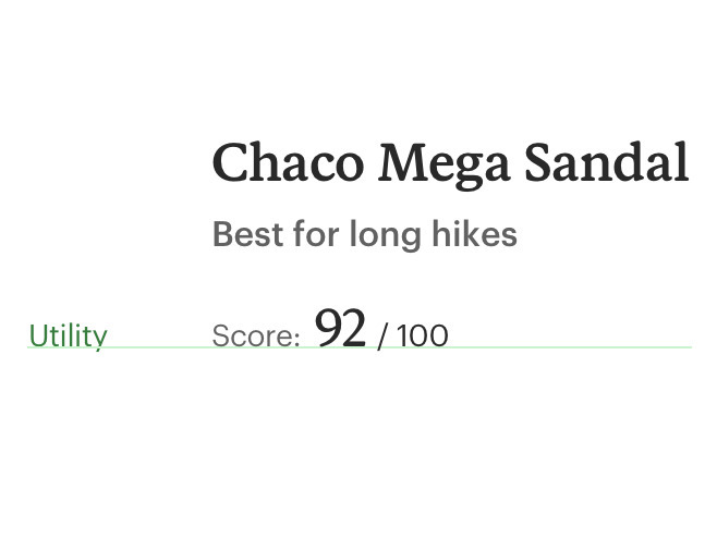
Do use utility or body styles for descriptive or utilitarian purposes.
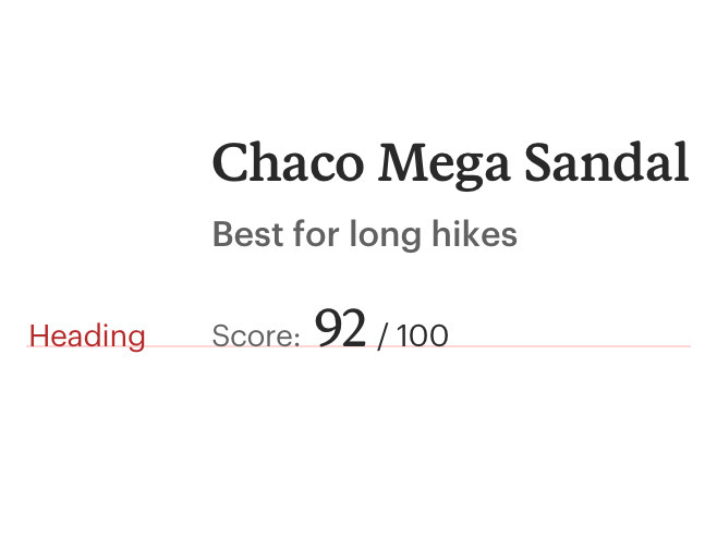
Don't use heading styles in areas that aren’t headlines. Instead, consider body or utility styles.
Text over image
Minimize text overlaid on images and multicolored background, which can degrade legibility. If text is overlaid on an image:
Color
When choosing heading colors, consider cdr-color-text-primary, cdr-color-text-secondary, cdr-color-text-emphasis, cdr-color-text-brand, or cdr-color-text-inverse.
Headings must:
Cedar does not offer pre-styled responsive headings. Instead, construct responsive headings by defining a heading style for specific breakpoints.
For instance, if the heading style is cdr-text-heading-serif-900 @lg, @md, and @sm sizes, set the heading style to cdr-text-heading-serif-800 at the @xs size. This helps to create optimal readability, spacing, and proportions for various breakpoint sizes.
An example in practice:
<cdr-text class="cdr-text--heading-serif-800@xs heading-serif-900">
  When you gear up, we give back
</cdr-text>
<template>
  <cdr-text class="custom-heading-class">
    When you gear up, we give back
  </cdr-text>
</template>
<style>
  @import '@rei/cdr-tokens/scss';
  .custom-heading-class {
    @include cdr-text-heading-serif-900;
    @include cdr-xs-mq-only {
      @include cdr-text-heading-serif-800;
    }
  }
</style>