button
CdrButton - Initiates an action, such as completing a task or submitting information Buttons allow users to trigger actions and navigate. Use buttons for important actions like submitting forms or confirming choices. Buttons can contain text, icons, or both.
| Type | Purpose |
|---|---|
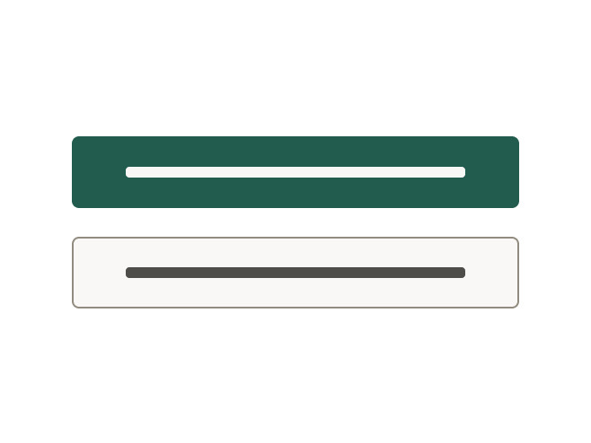
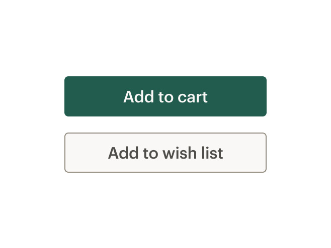
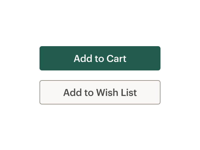
| Primary | For completing a task or to move forward in a process such as "Add to cart." There is only one primary action per major page section. |
| Secondary | For all actions that don’t move the user to the next step or require additional user actions such as "Add to wish list" or "Find a campout near you." |
| Link | Renders a button styled like a CdrLink. This can be used to create links with the padding and sizing options of a button. Can be used with the tag property set to the default "button" or "a." |
| Text and icon | For improving recognition about an object or action. |
| Icon only | Visually communicates an object or action in a limited space. Include alternative text to describe what the button does. |
| Icon only with background | Makes icon buttons more identifiable. Include alternative text to describe what the button does. Use with-background property in conjunction with the icon-only property. |
| Stateful | For buttons that trigger asynchronous actions, use the click event and dynamic properties to change the label or state of a button. |
| With link tag | For a CdrButton that looks like a button but behaves like a link, set tag="a" and pass an href. |
When to use
- Triggering an action
- Enabling a "final" action
- Progressing or regressing a user through a step in a flow
- Submitting requested information
- Confirming the completion of a flow or cancelling out of it
- Using
tag="a"andhrefwhen navigating to another page on the site
When not to use
- Taking users to a different part within the same page. Instead, use links ::
Choosing the right component
Links or buttons?
| Criteria | Link | Button |
|---|---|---|
| Answers the question | Where can I go? | What can I do? |
| Search engine crawlers | Can follow anchors for links () | Cannot follow links that are submitted by input or button |
| Default keyboard behavior | Triggered using the Enter key | Triggered using the Space or Enter key |
| Disabled | Cannot be disabled like buttons but can be made inert with tabindex=-1” and aria-hidden=“true” | Can be disabled with disabled attribute |
Links as anchors or buttons?
| Criteria | Link | Button |
|---|---|---|
| Navigating user to a new page or view | — | |
| Toggling a display to full screen | — | |
| Changing the URL | — | |
| Opening a modal window | — | |
| Causing a browser redraw or refresh | — | |
| Triggering a popup menu | — | |
| Supporting internal page jumps | — | |
| Can be disabled with disabled attribute | — |
Sizes
Three button sizes are available: small, medium, and large. Medium is the default size.
Generally, size buttons based on their content and use them to convey the importance of actions:
- Use large buttons for primary page actions
- Use small buttons for supplemental user actions
- For mobile screens using XS grid, use large buttons set to full width
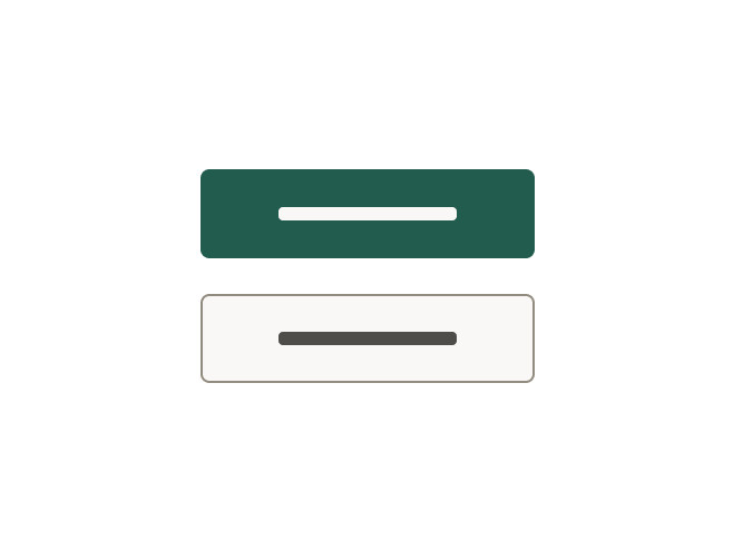
When stacking buttons vertically
- Align left borders
- Display all with the same width
- Separate each by stack-1-x spacing

When arranging horizontally
- Align top borders
- Display all with the same height
- Separate each by standard inline-1-x spacing


Do match button widths.
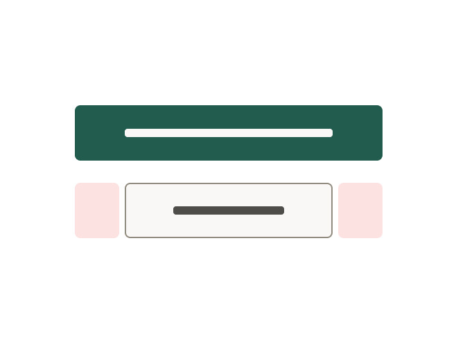
Don't mix buttons with different widths.
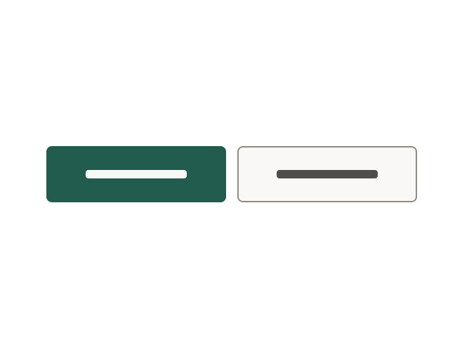
Do match button heights.
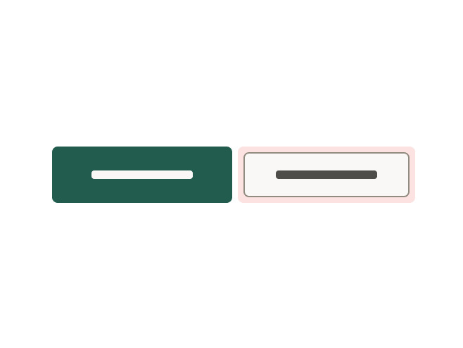
Don't mix button sizes.
- Clearly and concisely label buttons with 1–3 words and fewer than 20 characters, including spaces
- Start with a verb, if possible. Create action-oriented labels to set expectations for what the user will see next
- Never repeat the context of a label when the context is already clear. For example, for a "Save" button, do not expand to "Save Account Information"
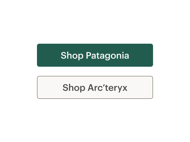
- Use sentence case. Do not use title case, all caps, or all lowercase. An exception is made for proper nouns, these should be capitalized if used in a button
Do minimize label length.
Don't put too much text in a button.
Do capitalize any proper nouns.
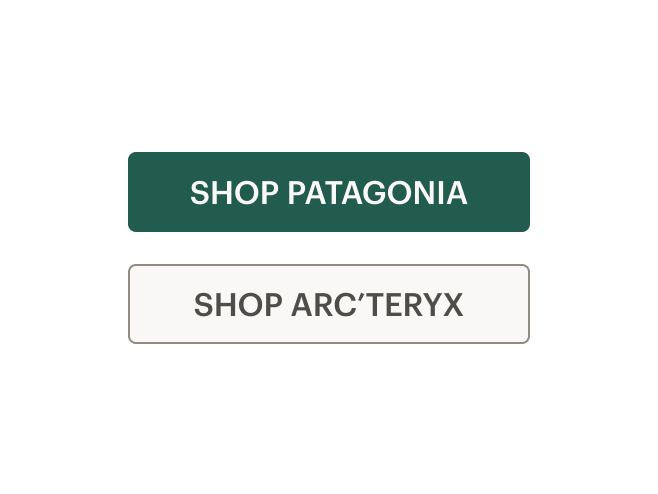
Don't use all caps.
Do use sentence case.
Don't use title case.
Constructing consistent and universal calls to action
- If leading to a brand, category or activity landing page, UI text for a call to action should be Explore Brand/Category/Activity Name
- If leading to a product detail page, UI text for a call to action should be Shop product name
- If leading to a collection or search result, UI text for a call to action should be Shop all Brand/Category/Activity Name
What Cedar provides
Because it is possible to define this component as a link or button, no specific WCAG compliance attributes are built into the control.
Keep in mind the following to make sure your component is WCAG compliant:
- Select the semantically-correct element, which will ensure assistive technologies have correct instructions for how to interact with the component
- Use the CdrLink component to make a button that looks like a link
- Don’t use
divorinputelements - Don’t add
role=\"button\"to the CdrButton component
Development responsibilities
When using this component, here's what you are responsible for:
- For icon-only buttons, provide
aria-labeltext to describe the button's action - If activating the button does not dismiss the current context, then focus typically remains on the button after activation, e.g., an Apply or Recalculate button
- If a description of the button's function is present, the button element has
aria-describedbyset to theidof the element containing the description - If the button is a toggle button, it has an
aria-pressedstate. When the button is toggled on, the value of this state is true, and when toggled off, the state is false - If the button action indicates a context change, such as move to next step in a wizard or add another search criteria, then it is often appropriate to move focus to the starting point for that action
- Clearly and concisely describe the button's action or destination when the button is clicked or tapped
- If the button text is "Shop now," the
aria-labelmight read: "Shop our (specific advertising category) now" - Avoid using "click here" or "start here" for button labels
- For buttons with the
tagset to"a", always provide anhrefattribute. Emptyhrefattributes are not considered true links - If screen space for text is minimal, provide text for screen readers to read
- If screen space for text is minimal, use an inline element for hidden text with the
cdr-sr-onlyclass
<cdr-cta>
    Start here <span class="cdr-sr-only">for help finding the proper sleeping bag</span>
  </cdr-cta>
For projects that cannot make use of the Vue.js component, the CdrButton styles are available through the @rei/cdr-component-variables package as SCSS mixins which can be applied to plain HTML elements. See examples on the component variables page.
CdrButton
Props
| Name | Type | Default |
|---|---|---|
tag Renders CdrButton as a button or a element | ButtonTag | button |
type Sets the button type | ButtonType | button |
modifier Modifies the style variant for this component | ButtonModifier | primary |
size Sets the button size; values can target responsive breakpoints | string | |
fullWidth Sets button width to 100% | union | false |
iconOnly Renders an icon-only button | boolean | false |
withBackground Renders an icon-only button with a background color and border | boolean | false |
Slots
| Name |
|---|
icon-left Icon to the left of text content |
icon Icon for icon-only button |
default Readable text of the button. Leave empty if icon-only |
icon-right Icon to the right of text content |