tab
Organizes related content into groups for people to navigate between
When to use
- Organizing related content in a single container
- Flipping between multiple panes or sections
- Grouping content to display horizontally
- Content can be broken into discrete parts #dont
- Grouping content to display vertically. Instead, use accordion
- Creating primary navigation that links to other pages
- Comparing related content. Instead, use a table ::
When not to use
- Keep tabs in the same order, even when some tabs are disabled
- Keep to no more than 6 tabs
- Never display fewer than 2 tabs
- Avoid changing the order of the tabs often. If your content changes frequently and needs to be selectively displayed, consider adopting a filter pattern as in this product display example
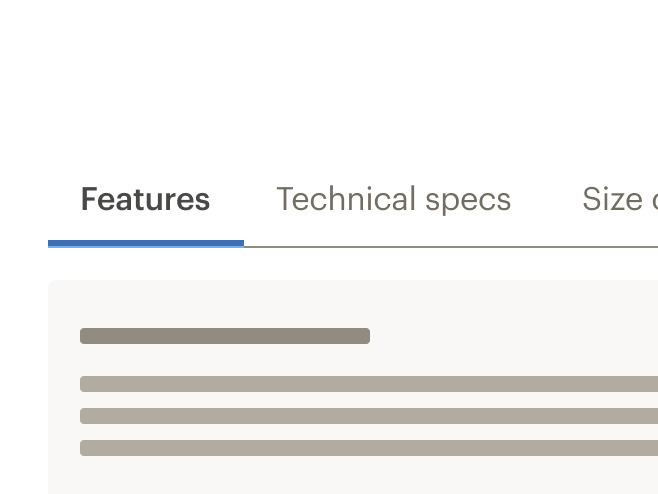
Do display a tab section on load.
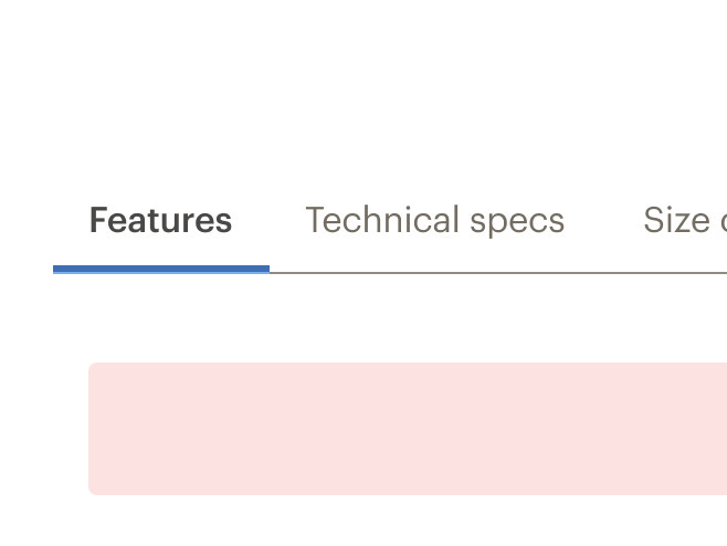
Don't display tabs without a section visible.
Do use tabs with at least 2 buttons.
Don't use tabs with only 1 button.
- Order the tabs by priority or importance from left to right
- Ensure each tab label is unique
- Never truncate tab labels
- Tab headers can be animated, but tab content shouldn't

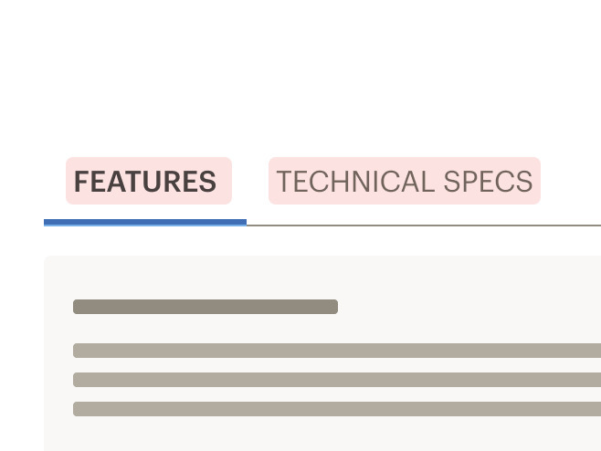
Do use title case for tab labels.
Don't use all caps for tab labels.

Do write short and meaningful tab labels. Between 1-2 words is best.
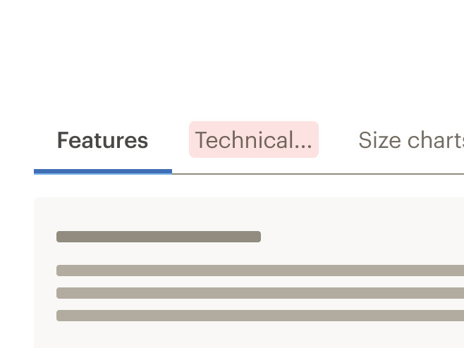
Don't truncate tab labels. If a label overruns the container, find a shorter alternative.
- The first tab section is selected by default
- Only one tab can be selected at a time
- The tab currently selected is always highlighted
- Tabs are scrollable by default and do not wrap to a second line
- Tabs become scrollable when the length of the labels exceed the width of the container
- Inactive tab panels are rendered for SEO purposes
- Tabs can change styles based on breakpoint: Default at MD/LG, compact and full width at XS/SM
- Tabs labels never wrap to two lines
- Scroll is set by default
- If tabs exceed width of viewport, a gradient is added to the end (right) of tab container
- When scrolled to end of tabs, a gradient is added to the beginning (left) of tab container
- Maintain layout for tabs when switching to smaller viewports. Do not replace the tab component with the accordion component
- Switching between tab component and accordion component is not supported in Cedar components library
What Cedar provides
- Uses text color with a Level AA contrast ratio of 4.5:1 contrast between the text color and the background (but only when displayed on light backgrounds)
- Includes
tablistrole in tabs header container - Includes
tabrole in tab header element - Includes
tabpanelrole in tab content element
Development responsibilities
When using this component, here's what you are responsible for:
- Left arrow and right arrow keys: moves user between tabs
- Down arrow: moves user into the content within the active tab section
- Up arrow: returns user to the selected tab
Tabs are built from two components: CdrTabs and CdrTabPanel. These are meant to be used together.
The cdr-tab-panel name property sets the tab display value and is used for reference.
<cdr-tabs>
   <cdr-tab-panel name="tab1">Tab 1 Content</cdr-tab-panel>
 </cdr-tabs>
CdrTabs
Props
| Name | Type | Default |
|---|---|---|
height Sets height of the tabs container element | string | 240px |
activeTab Sets the index of the tab that should be active on initial page load. Note that this property is zero-indexed | number | 0 |
modifier Modifies the style variants for this component | string | |
size Use small to reduce spacing around the tabs for a denser visual design | string | |
backgroundColor Sets the background color of the tab. For CdrTabs that are rendered on non-primary backgrounds | string | CdrColorBackgroundPrimary |
Slots
| Name |
|---|
default CdrTabs content (CdrTabPanel components) |
CdrTabPanel
Props
| Name | Type | Default |
|---|---|---|
id Sets reference identifier for tab content. Required for accessibility | string | |
name Sets tab display name. Required and must be unique for each tab | string | |
ariaLabelledby Sets reference identifier for tab header. Required for accessibility | string |
Slots
| Name |
|---|
default CdrTabPanel content |
Events
| Name | Parameters |
|---|---|
tab-change Emits when active tab is changed | state, panelId |