switch
Permits selection from two opposing options
CdrIconSwitch is a system-wide control used to quickly change between two possible states. This component is only used for binary actions occurring immediately after the user makes any changes.
When to use
- Displaying two options (yes or no; on or off)
- Changing system-level settings, preferences, or other functions
- The change needs to take immediate effect #dont
- Requiring the user to save or submit to apply the state. Instead, use checkboxes or radio buttons
- Showing more than one option. Instead, use checkboxes
- Allowing users to filter. Instead, use checkboxes or chips ::
Choosing the right component
Switches, checkboxes, radio buttons, and toggle buttons are all similar types of selection controls, but are generally not interchangeable. If you're not sure which one to use for a certain scenario, use this comparison table.
| Criteria | Radio button | Checkbox | Single checkbox | Switch | Toggle button |
|---|---|---|---|---|---|
| Selections available | At least two | At least one | Just one | Only two (on or off) | At least two (this or that) |
| Default option | Yes | No | Yes | Yes | Yes |
| Choices | Mutually exclusive | Independent of each other | Mutually exclusive | Mutually exclusive | Mutually exclusive |
| Takes effect | After a user clicks a submit button | After a user clicks a submit button | After a user clicks a submit button | Immediately | Immediately |
When not to use
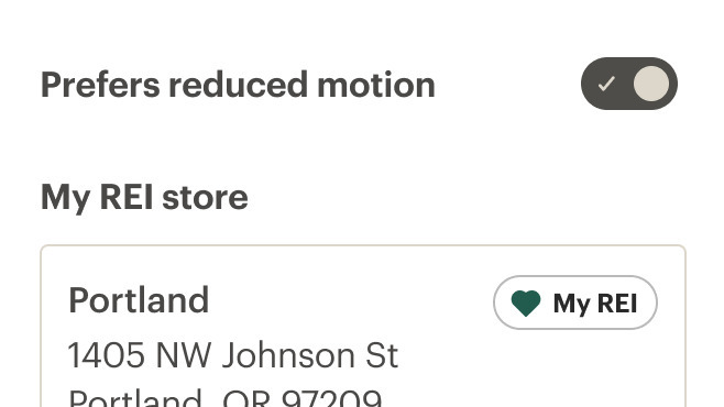
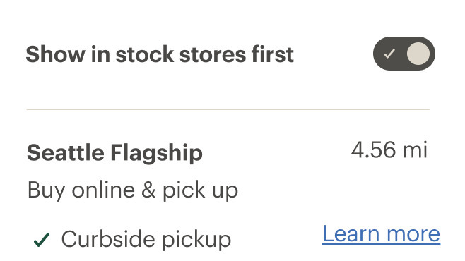
Do use the switch component for preferences, settings or other immediate functions.
Don't use the switch component for filtering or sorting content.
- Keep labels short and direct
- The label should describe what the control will do when the switch is on
- Labels should describe the state of the system when the switch is on (when in doubt, say the label aloud and append "on/off" to the end)
- Start labels with a capital letter and use sentence case
- Labels should have one or two words, preferably nouns, describing the functionality of the switch

Do use keywords first, forming unique labels.

Don't overload the label with too much content.
What Cedar provides
- References the
idof the switch label by using thearia-labelproperty - Sets the role of the switch button element to
switch - Applies the
aria-checkedattribute
Development responsibilities
When using this component, here's what you are responsible for:
- Always provide a descriptive label as a slotted element to the
cdr-switchelement - Always provide an
idto the label of the switch
CdrSwitch
Props
| Name | Type | Default |
|---|---|---|
id Sets a custom ID for the switch. If this value is not set, it will be auto-generated | string | |
size Sets the size of the switch | SwitchSize | medium |
fullWidth Sets the label and switch to expand to the full width of its container with space-between | boolean | false |
modelValue Required v-model binding | boolean |
Slots
| Name |
|---|
default The label for the switch |
Events
| Name | Parameters |
|---|---|
update:modelValue Event emitted by v-model on switch | modelValue |