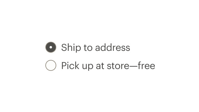
radio button
Permits the selection of only one option from a list of two or more
When to use
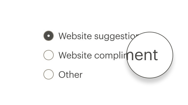
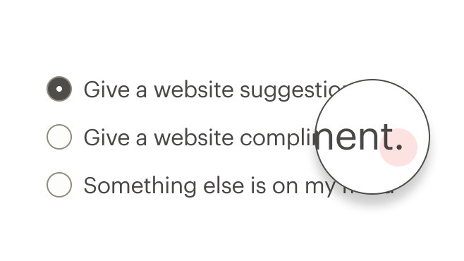
- Allowing the selection of only one choice from a list
- Needing to view all available options
- Comparing between a list of selections #dont
- Selecting from a list when multiple choices are allowed. Instead, use checkboxes
- Providing a single selectable option. Instead, use a stand-alone checkbox ::
When not to use
Using in lists
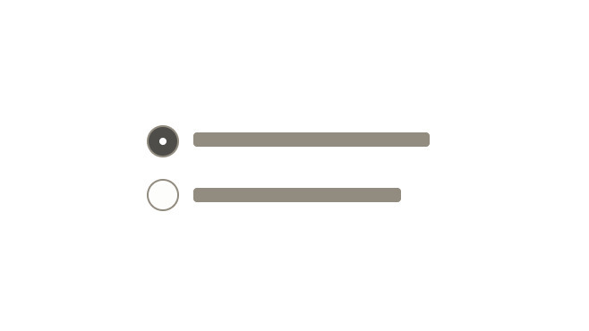
- Use a logical order, whether it’s alphabetical, numerical, or time-based
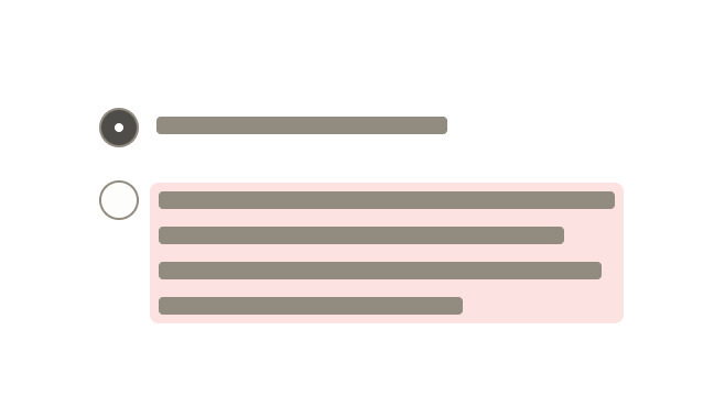
- Labels should have approximately equal length
- Clearly communicate the effect of selecting the option
- Provide a link or include a subtitle for more information. Don’t rely on tooltips to explain a radio button
Labels
Do use sentence case, with only proper nouns capitalized.
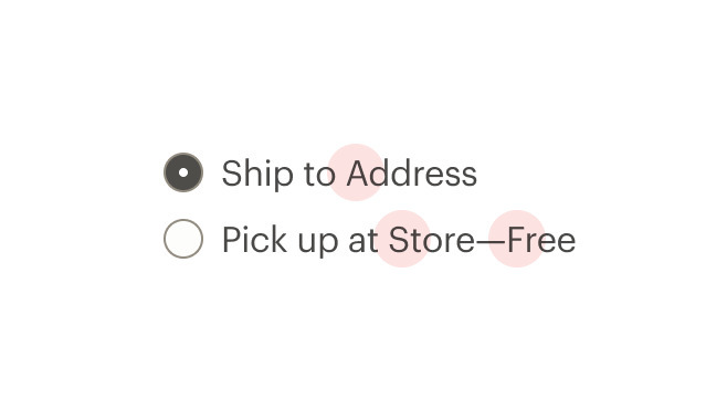
Don't use title caps for labels.
Do make labels brief.
Don't put too much text in the label.
Do write labels as sentence fragments with no ending punctuation.
Don't add terminal punctuation at the end of a label.
What Cedar provides
Wraps the input in a label element and automatically associates it with the label.
Development responsibilities
When using this component, here's what you are responsible for:
Make each radio button focusable and keyboard accessible:
- When radio button has focus, the space key changes the selection
- Tab key moves to next element in list
Avoid nesting CdrFormGroup. This component should be:
- Used when associating group of radio buttons
- Identified or described as a group using the
labelproperty or slot
Custom radio buttons maintain accessibility requirements. The radio button icon is only visually hidden and replaced with custom style.
For projects that cannot make use of the Vue.js component, the CdrLabelWrapper styles are available through the @rei/cdr-component-variables package as SCSS mixins. These can be applied to plain HTML elements. See examples on the component variable page.
The CdrRadio component requires v-model to track the value of selected radios.
Use the hide-figure modifier to hide the radio button itself. This leaves the text label as the clickable element. Add appropriate custom styles to convey selected and unselected states.
<template>
  <cdr-radio
    name="example"
    custom-value="model1"
    v-model="model"
    modifier="hide-figure"
    input-class="no-box"
    content-class="no-box__content"
  >
    Add to cart
  </cdr-radio>
</template>
<style>
.no-box:checked ~ .no-box__content {
  color: green;

  &::after {
    content: '(checked)';
  }
}
</style>
CdrRadio
Props
| Name | Type | Default |
|---|---|---|
labelClass Adds CSS class to the label for custom styles | string | |
inputClass Adds CSS class to the input for custom styles | string | |
contentClass Adds CSS class to the slot wrapper for custom styles | string | |
disabled Disables the radio | boolean | |
name Required Sets the name of the radio button | string | |
modifier Modifies the style variants for this component | string | |
size Sets the radio size; values can target responsive breakpoints | string | |
background Sets the background color the radio button is rendered on | PrimarySecondary | |
customValue Sets the value of the radio | union | |
modelValue v-model binding | union |
Slots
| Name |
|---|
default |
Events
| Name | Parameters |
|---|---|
update:modelValue Event emitted by v-model on the radio's <input> element | modelValue |