image
CdrImg - Media for capturing attention and communicating messages Images enhance content and convey information visually. Use images to support your message, showcase products, or illustrate concepts. Always provide meaningful alt text for accessibility.
When to use
- Illustrating a product feature
- Allowing comparisons between similar items
- Capturing the user’s attention
- Telling a story
- Communicating the REI brand message
- Explaining a complex procedure or how to perform an action
When not to use
- Adding imagery to simply take up space ::
Aspect ratio
Use conventional aspect ratios:
- Square: 1/1
- Portrait: 1/2, 2/3, 3/4, 9/16
- Landscape: 2/1, 3/2, 4/1, 4/3, 16/9
Quality
Always maintain high image quality. Choose the right file format when saving your images to ensure proper image quality and file size:
- For photos, use JPEG. Optimize JPEG files to find a balance between size and quality
- For bitmap/raster artwork, SVG is typically the best option
Sizing
- Avoid small file sizes that pixelate the image
- Avoid unnecessarily large file sizes. Export images at the lowest file size possible without compromising quality
- Use
srcsetandsizesto deliver optimized images across different devices - Must display images at a proper pixel size compared to natural size
Color and contrast
- Test images for high contrast displays
- Ensure no meaning is lost when removing colors
- Include text only with sufficient contrast
Cropping images
Use the position prop to adjust the images object-position
Crop images by specifying the starting point. Adjust the starting background position on the x-axis of the image:
- Left: Orients the image to its horizontal left
- Right: Orients the image to its horizontal right
- X-center: Orients the image to its horizontal center
Adjust the starting background position on the y-axis of the image:
- Top: Orients the image to its top
- Bottom: Orients the image to its bottom
- Y-center: Orients the image to its vertical center
Accepts x and y axis combination (e.g. position="top left" or position="25% 75%"):
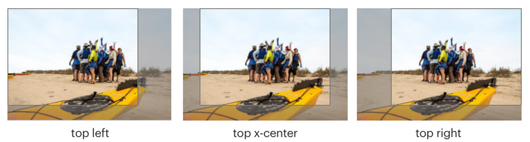 Images are cropped on y-axis with top value and on x-axis with left, x-center, and right values.
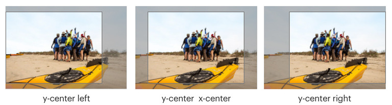 Images are cropped on y-axis with y-center value and on x-axis with left, x-center, and right values.
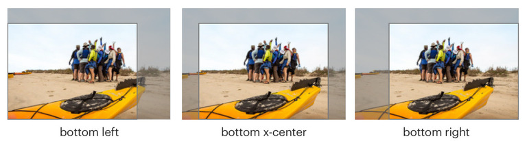 Images are cropped on y-axis with bottom value and on x-axis with left, x-center, and right values.
File names
- Image file name should include primary keyword or what the page is targeting
- Showcase keyword targeting through file name and alt text
Text overlay
Avoid overlaying text on images for the most optimal experience. However, if your design calls for it and you understand the accessibility implications, use the following guidelines.
Only display heading text on non-solid backgrounds:
- Text should be at least 18px
- Never allow overlaid text to wrap. Longer strings of text can be harder to navigate when the background varies
- Consider adding a semi-transparent black gradient over the image in the CSS
- Consider positioning the text in a solid content container over the image
Additional recommendations:
- Apply only vertical gradient backgrounds. Avoid horizontal, diagonal, and radial gradients
- Always include a backup background color so that when the background image is disabled, text is still legible and passes contrast requirements
- For help in determining whether your text and image combination conforms to the required contrast ratio, use the Color Contrast Analyzer Chrome plugin. REI Employees can download the Color Contrast Analyzer application from Self-Service.
Decorative images
If using the HTML <img> element, add:
- An empty
altattribute (CdrImg will handle this for you) - Attribute
role="presentation"
Alternative text
Writing guidance:
- Be succinct. Ideally, one sentence or less
- Be informative and accurate
- If images of text are used, the
altattribute should contain the same words that appear in the image - Avoid repetitive labels. For example: “image of” or “picture of”
- Use a short description conveying the essential information presented by the image without burdening users with unnecessary details
- Use long descriptions to provide enough information for complex images, such as graphs, charts or diagrams
For groups of images that convey a single piece of information, apply the alt attribute to only one image for the entire group.
For image maps with multiple clickable areas:
- Provide an overall context for the set of links using
altattribute - Each individual clickable area should have an
altattribute that describes the purpose or destination of the link
Use this decision tree to determine how to use the alt attribute.
This component allows for:
- The ability to control image display at small, medium, and large breakpoints
- Lazy loading
- Using the
srcetandsizesattributes for controlling which image loads at a certain screen size
What Cedar provides
Decorative images need an empty alt attribute to meet accessibility requirements:
- An empty
altattribute is added into the image element by default
Development responsibilities
When using this component, here's what you are responsible for:
Providing descriptive text for the alt attribute:
- Informative images are meant to convey a simple concept or information. Write alt text to express the concept, which typically isn’t a literal description of the image
- Functional images are meant to help initiate an action (such as a printer icon), rather than conveying a concept. Describe the functionality of the link or button, rather than the visual image
- When an image contains text for the audience to read, the alt text should contain the same words that appear in the image
Ratio
The ratio prop passes through to the CSS aspect-ratio property.
<CdrImg
  src="stewardship.jpg"
  alt="REI employees building trails during a stewardship event"
  ratio="3/2"
/>
Use the fit prop to set how the image resizes to fit the ratio of the container. This prop passes to the CSS object-fit property.
<CdrImg
  src="stewardship.jpg"
  alt="REI employees building trails during a stewardship event"
  ratio="3/2"
  fit="cover"
/>
Changing ratio per breakpoint
To change what aspect-ratio is served across breakpoints, forgo the ratio prop and target the CSS custom property directly.
<template>
  <CdrImg
    src="stewardship.jpg"
    alt="REI employees building trails during a stewardship event"
    fit="cover"
    class="custom-class"
  />
</template>

<style lang="scss">
@import '@rei/cdr-tokens/scss';

.custom-class {
  --cdr-img-aspect-ratio: 4/1;
  @include cdr-xs-mq-only {
    --cdr-img-aspect-ratio: 4/3;
  }
}
</style>
Error event handler
CdrImg will bind any event handlers to the img element that it wraps. This is intended to support attaching an error handler function in case an image does not load but can be used for any HTML/JS event. Note that because images are usually not "interactive" elements you should not bind click handlers to them.
<CdrImg
  src=""
  @error="eventHandler"
/>
Performance
Use the loading="lazy" property to apply lazy load to:
- Internal applications with large images
- Images that would benefit from changes due to platform or breakpoint
<CdrImg
  src="stewardship.jpg"
  alt="REI employees building trails during a stewardship event"
  loading="lazy"
/>
Use the srcset and sizes properties to load the optimal image size for the user's screen. CdrImg supports any attribute that a native img element accepts. See the MDN documentation for more information on the loading, srcset, sizes, and other properties.
<CdrImg
  src="stewardship.jpg"
  alt="REI employees building trails during a stewardship event"
  srcset="stewardship-xs.jpg 300w,
    stewardship-md.jpg 600w,
    stewardship-lg.jpg 1200w"
  sizes="(min-width: 66em) 33vw,
    (min-width: 44em) 50vw,
    100vw"
srcsetdoes not replacesrc.srcis still a required attribute.- You can only specify one
altattribute. Youralttext must still work for all sources in yoursrcset.
CSS Custom Properties
The following custom properties all map to their respective CSS property on the <img> element. Use props as the preferred implementation, but these properties are helpful if you need to customizing across breakpoints, for example.
| Custom Property | CSS Property |
|---|---|
--cdr-img-aspect-ratio | aspect-ratio |
--cdr-img-object-fit | object-fit |
--cdr-img-object-position | object-position |
--cdr-img-border-radius | border-radius |
CdrImg
Props
| Name | Type | Default |
|---|---|---|
src Required The image src | string | |
alt The image alt. Defaults to empty string. | string | |
srcset Comma separated list of image sources | string | |
sizes Comma separated list of source sizes | string | |
fit Object fit of the image, passes value to CSS object-fit property Possible values: none, contain, cover, fill, scale-down | ImageFit | |
position Object position of the image, passes value to CSS object-position property. Possible values: center, top, right, bottom, left | string | |
radius Border radius of the image. Accepts shorthand for cedar radius tokens ("soft", "softer", "round") or a custom value which is passed to the CSS border-radius property. Possible values: unset, soft, softer, round, 10% | union | |
ratio Aspect ratio of the image, passes to the CSS aspect-ratio property. Possible values: auto, 1/1, 1/2, 3/4, 9/16, 2/1, 4/3, 16/9 | string | |
loading Value for loading attribute ("lazy", "eager", "auto") | ImageLoading | |
decoding value for decoding attribute () | union | |
fetchpriority value for fetch priority attribute | union |